
5 Exploratory Data Analysis
This is the Open Access web version of Veridical Data Science. A print version of this book is published by MIT Press. This work and associated materials are subject to a Creative Commons CC-BY-NC-ND license.
Since our eyes and brains are not wired to detect patterns in large data tables filled with text and numbers, communication about data and data-driven results rarely comes in the form of raw data or code output. Instead, data and data-driven results are usually either summarized (e.g., using an average/mean) and presented in small summary tables or they are presented visually in the form of graphs, in which shape, distance, color, and size can be used to represent the magnitudes of (and relationships between) the values within our data.
An important part of our job as data scientists is to clearly and effectively present insights that arise from our data and the algorithms we apply to them, both so that we can understand them ourselves and so that we can explain them to others (especially those who might use such insights to make real-world decisions). While your job might not involve producing flashy infographics for the general public, your job will undoubtedly involve communicating your data-driven findings to someone for whom the information will be useful, even if it is just for the rest of your data science team.
The task of producing insightful data visualizations is not limited to just one part of the data science life cycle (DSLC) but is instead spread throughout the entire DSLC. As a part of the data cleaning procedure from sec-cleaning, we created a range of data visualizations (such as histograms and bar charts) to help us uncover any issues and inconsistencies hidden within our data. We will also use data visualization techniques to summarize, describe, and evaluate the data-driven results that emerge from the algorithms that we will use in the later stages of the DSLC. In this chapter, however, we will focus on using data visualization to conduct exploratory data analysis (EDA): the task of visually and numerically summarizing the patterns, trends, and relationships that a dataset contains in the context of the domain problem that we are solving.
In this chapter, we will continue working on the organ donation project introduced in sec-cleaning, whose goal was to identify countries that have demonstrated an increase in organ transplant donation rates over time as well as which countries have the highest organ donation rates using the Global Observatory on Donation and Transplantation (GODT) global organ donation data. The goal of this project is exploratory in nature: the answer to these questions will likely come in the form of a collection of informative figures or tables that convey and/or summarize a trend in the data.
The difference between the data visualizations that we created as a part of our data cleaning workflow in sec-cleaning and the visualizations that we will produce in this chapter lies in our motivations. The purpose of our data cleaning explorations in sec-cleaning was to identify and diagnose potential problems with our data, whereas the purpose of the EDA explorations in this chapter is to understand the trends and patterns that will answer our domain question. That said, while the goals of the previous chapter’s data cleaning visualizations and this chapter’s EDA visualizations differ, the underlying techniques (e.g., computing averages and ranges and producing histograms, bar charts, and line plots) are similar. Moreover, these are the same techniques that will also be used later in the DSLC to understand and explore the output of the algorithms that we will apply.
While we could write an entire book just on the principles of creating effective data visualizations (regardless of whether your goal is to identify issues with your data, to understand it, or to communicate some data-driven results), there already exist several excellent resources that do just that. Examples include “Storytelling with Data” (Knaflic 2015), “Fundamentals of Data Visualization” (Wilke 2019), and “Data Visualization” (Healy 2019). Rather than repeating the content of these excellent resources, this chapter will be fairly brief. After introducing a question-and-answer-based EDA workflow as well as the concept of exploratory versus explanatory data analysis in sec-eda-question-workflow, sec-numeric-explorations will provide some examples of common numeric explorations and their visualization counterparts. sec-comparability will discuss the principle of comparability in the context of EDA, and sec-eda-pcs will end the chapter by highlighting the role of the principles of the predictability, computability, and stability (PCS) framework in generating trustworthy EDA results. Note that we use the terms “chart,” “plot,” “figure,” “visualization,” and “graph” interchangeably in this book.
5.1 A Question-and-Answer-Based Exploratory Data Analysis Workflow
The process of EDA involves creating a variety of preliminary data visualizations and numeric summaries that elucidate the patterns and trends in the dataset, with a focus on those that are relevant to the overall goal of the project.
However, when faced with a new dataset, it can be really hard to know where to start your explorations. Rather than trying to plot all your data at once, we recommend that you follow a question-and-answer EDA workflow, which involves using domain knowledge to guide your explorations by asking and answering specific questions related to the domain problem that you are trying to solve, such as “Are global organ donations increasing over time?” and “Which country reported the highest number of organ donations in 2017?” Each of these questions can be the launching point for a whole series of other questions. For instance, after creating a summary table or a bar chart to show that the US was the country that reported the most organ donations in 2017, you might then begin to wonder whether this is just a reflection of the US also having a very large population, prompting another question: “Which country had the highest number of organ donations per million people in 2017?” the answer to which is Spain (rather than the US). Since every exploratory question can lead to a whole new set of questions, it is very easy to get lost in a labyrinth of exploration. Our advice is to keep the overall project goal in mind and use it to guide your explorations toward asking and answering questions that are relevant to the project goal.
5.1.1 Choosing a Data Visualization Technique
Given an exploratory question, the next task is to determine which exploratory technique will be best suited to answering it. Figure fig-visual-flow-chart presents a flowchart that can help you decide which visualization technique to use based on the types of variables that are involved in your exploratory question. For a detailed summary of the visualization techniques introduced in Figure fig-visual-flow-chart (as well as some additional techniques), we recommend referring to “Fundamentals of Data Visualization” (Wilke 2019) and “Data Visualization” (Healy 2019), both of which are available for free online.

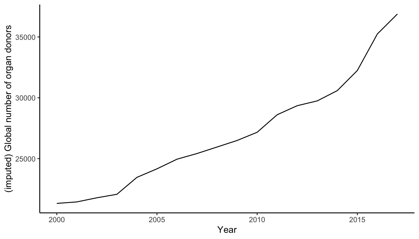
As an example, let’s ask the question “Are global organ donations increasing over time?” This question is asking about two numeric variables in the organ donation data (the number of organ donations and the year), one of which is a time-based variable. Thus, based on Figure fig-visual-flow-chart, a line plot seems to be a good choice, such as in Figure fig-line-global-trend.
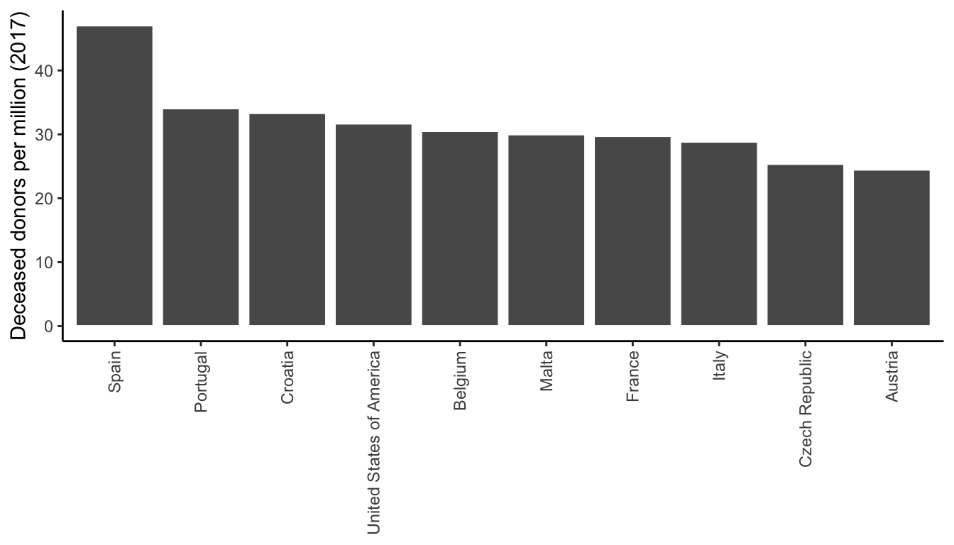
If instead, we wanted to ask the question “Which country had the highest number of organ donations per million people in 2017?” then we are asking about a numeric variable (number of organ donations) and a categorical variable (country), so perhaps a bar plot will be more helpful, such as in Figure fig-bar-country-donors. However, this question might also be answered by producing a table that reports the 2017 donor rate for the top few countries, arranged in decreasing order, such as in Table tbl-table-country-donors. The best summary of your data is not always visual (we will discuss some numeric summaries in sec-numeric-explorations).
| Country | Donors per Million |
|---|---|
| Spain | 47.0 |
| Portugal | 34.1 |
| Croatia | 33.3 |
| United States of America | 31.7 |
| Belgium | 30.5 |
| Malta | 30.0 |
| France | 29.7 |
| Italy | 28.9 |
| Czech Republic | 25.4 |
| Austria | 24.5 |
Note that the flowchart in Figure fig-visual-flow-chart does not include all possible visualization techniques and should be used as a general guide, rather than a strict set of rules. Moreover, the “variables” (features) that we refer to in the flowchart need not be an actual variable from your data but may instead be a summary of a variable (such as the average number of organ donors by year or region) or a new variable created by combining multiple features (such as the organ donation rate per million, which is the number of donors divided by the population and multiplied by 1 million). Most plots can also be customized to include information from additional variables using color or size, or even by combining multiple charts (such as creating a grid of plots, adding scatterplot points to a line plot, or overlaying a line on top of a set of boxplots).
Since there are typically many ways to visualize any given pattern or relationship, we encourage you to investigate the stability of your conclusions to your data visualization judgment calls. For example, does your conclusion change when you use a line chart (whose \(y\)-axis need not start at 0) rather than a bar chart (whose \(y\)-axis should typically start at 0 since it is intended to represent a count)? What about when you use color to distinguish between different countries in a single plot versus creating a separate plot for each country? While some visualization techniques may convey a message better than others, your overall conclusions should be stable across reasonable alternative judgment calls.
5.1.2 Exploratory and Explanatory Data Analysis
While this question-and-answer-based EDA process is very helpful for uncovering a variety of patterns or trends in the data, not all the exploratory avenues that you travel will ultimately lead to interesting findings (you will likely need to produce many uninsightful visualizations to find just a few interesting ones). Moreover, when you do manage to produce an exploratory plot that contains some interesting and relevant insight, you will usually need to polish it if you want to present it to an external audience, whether to your team, the executives at your company, or for a scientific paper.
The term exploratory data analysis (EDA) typically refers to these preliminary data visualizations (including numeric summaries), some—but certainly not all—of which will contain interesting patterns and trends. These visualizations are typically produced fairly quickly and roughly and are not necessarily well suited for explaining these findings to others.
Thus we will introduce a new term, explanatory data analysis, to refer to the process of producing polished presentation-quality figures that will be used to communicate the particularly interesting patterns and trends to an external audience. Note that we specifically use the acronym EDA to refer to the initial exploratory data analysis rather than to explanatory data analysis. The term exploratory data analysis was brought into popular use by John W. Tukey in his book “Exploratory Data Analysis” (Tukey 1977), and we are borrowing the term explanatory data analysis from Cole Nussbaumer Knaflic’s book “Storytelling with Data” (Knaflic 2015).
Fortunately, the general techniques and plot/chart types for producing data visualizations are the same for both preliminary exploratory and polished explanatory figures. The difference between the two processes lies in the time spent customizing your figures. Producing effective polished explanatory visualizations involves highlighting the elements of the preliminary exploratory plot that emphasize a clear takeaway message, and removing the elements that obfuscate it. Note that it is fairly common to uncover an interesting pattern or relationship using one particular preliminary exploratory visualization technique (e.g., a line plot), and create a polished exploratory visualization that uses a completely different visualization technique that more clearly conveys the pattern or relationship that you uncovered during your preliminary explorations (e.g., perhaps you realize that the message can be more clearly conveyed using a map or a bar chart).
Some tips for creating effective presentation-quality polished explanatory data visualizations include:
Ensuring that the plot has a clear takeaway message (e.g., “The rate of organ donation rates is increasing over time”).
Use color thoughtfully and sparingly. Just because you can add more color doesn’t mean that you should. Try to avoid using more than five or six colors in a single figure, and be sure to check that your color choices are not distorting the figure’s conclusions. Avoid using red and green in the same plot since these colors are hard for color-blind people to distinguish.
Use size, color, and text to guide the audience’s attention and highlight a particular element of the chart.
Use transparency to reduce “overplotting” (which happens when there are a lot of overlapping plot elements, such as points or lines, making it hard to see any patterns), especially when you are plotting a large amount of data. If your dataset is very large and adding transparency is not enough, try visualizing just a subsample (a random sample of data points, chosen without replacement) of your data (a technique known as subsampling).
Titles, axes, and legend text should be meaningful and human-readable, and legend elements should be ordered in a meaningful way.
Note that the design choices (e.g., the choice of color, the choice to use transparency over subsampling) that are made at this stage can have an impact on your conclusions, so it is a good idea to investigate the effect of these data visualization judgment calls on your conclusions in a stability analysis (see sec-stability-viz for an example).
For more advice on producing effective polished explanatory figures (with a range of examples), we highly recommend “Storytelling with Data” (Knaflic 2015). You don’t need to use fancy software to produce impactful explanatory figures. Impactful data visualizations can be produced in R (e.g., using the ggplot2 R package) or Python (e.g., using libraries such as matplotlib, seaborn, and plotly), and there also are many software applications for producing high-quality visualizations that don’t require coding skills, such as Tableau.
The remainder of this section will provide an example of turning an exploratory finding into an explanatory figure. Suppose that you wanted to ask the question “How do the donation rates change over time for each country?” Which plot type would you use? The variables involved in this question are (1) (numeric) donation rate, i.e., total deceased donor rate per million; (2) (time) year; and (3) (categorical) country. So we are visualizing the relationship between many variables: one numeric variable, one time-based variable, and one categorical variable. The flowchart in Figure fig-visual-flow-chart indicates that a multiline plot (which contains one line for each country) might be a good choice.
A rough preliminary exploratory multiline plot (in which we have highlighted a few countries using different colors) is shown in Figure fig-organ-line-plots-colored. From Figure fig-organ-line-plots-colored, we learn that Spain consistently has the highest organ donation rate and that Croatia has rapidly improved its organ donation rates since the early 2000s (although keep in mind that the survey theoretically only began in 2007, so the pre-2007 data is a little bit mysterious).
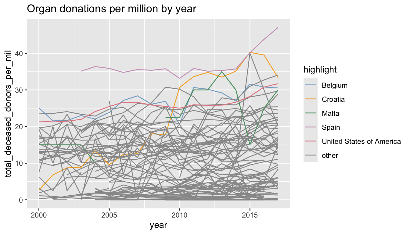
Although Figure fig-organ-line-plots-colored provides a general idea of the donation trends contained in the data, it fails to tell a clear story because it is so busy. By looking critically at this preliminary exploratory figure can you identify a few modifications that you might make to polish Figure fig-organ-line-plots-colored into a clearer explanatory figure?
The first step is to choose a clear message. There are many trends that we could choose to highlight, but there are two that feel particularly relevant to our project goal: (1) Spain is a clear world leader in organ donation rates, and (2) Croatia has successfully increased their donation rates over time. So let’s create two polished explanatory plots, one to convey each message.
Figure fig-lines-highlight-clean shows a pair of polished explanatory plots that we adapted from the preliminary exploratory figure in Figure fig-organ-line-plots-colored. In Figure fig-lines-highlight-clean(a), we highlighted Spain’s trend line and added a title that clearly states the takeaway message “Spain is the world leader in organ donations.” In Figure fig-lines-highlight-clean(b), we instead highlighted Croatia’s trend line, and added a title that clearly states the takeaway message “Croatia has dramatically increased their organ donation rates.”
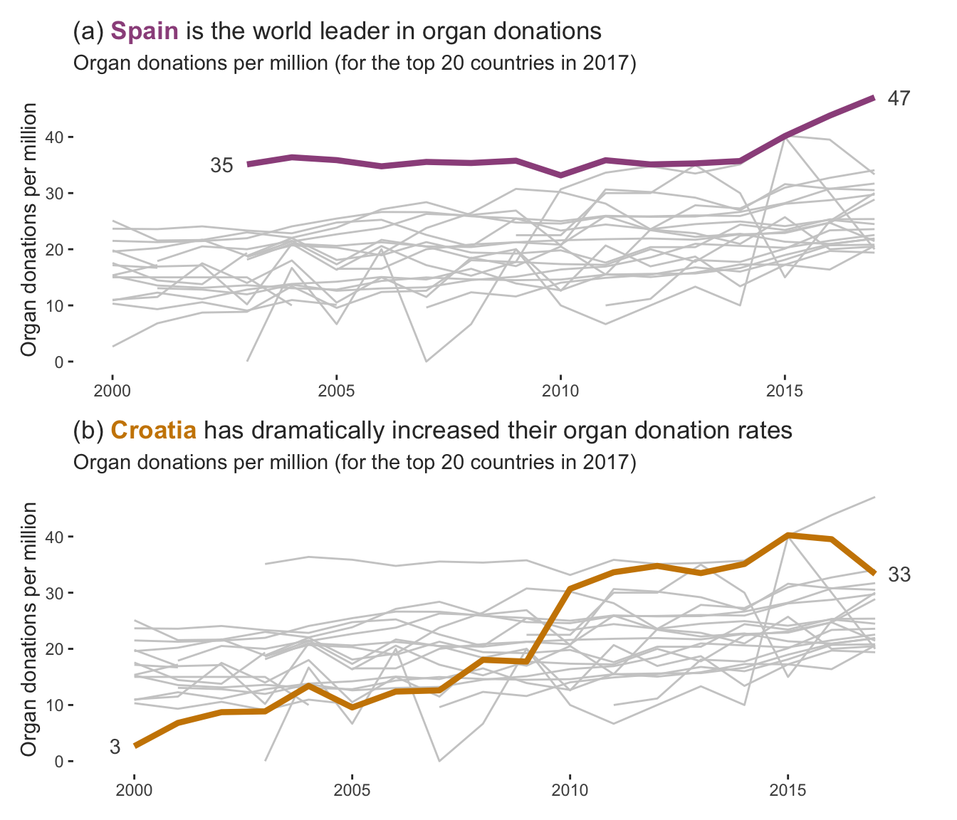
Compare these polished explanatory figures in Figure fig-lines-highlight-clean to the preliminary exploratory plot in Figure fig-organ-line-plots-colored. Can you list the specific changes that we made to create these polished explanatory plots? All these figures were created in R using the ggplot2 package. If you’re looking for a challenge, try to produce some other polished explanatory plots yourself. The code for producing these figures can be found in the 02_eda.qmd (or .ipynb) file in the organ_donations/dslc_documentation/ subfolder of the supplementary GitHub repository.
Every polished explanatory plot must be tailored to the audience to which you intend to show it. While Figure fig-lines-highlight-clean would be great for a presentation or a brochure, if you were instead preparing a research paper, you might want to present a plot with more detail, such as the grid of multiline plots presented in Figure fig-lines-grid, where each panel highlights the data for a different country. In general, if you are communicating with the public, your figures should be much simpler (i.e., contain less detail) than if you are communicating with domain experts who will want more details. Similarly, figures prepared for a journal article should be more detailed and can use smaller fonts than figures that are prepared for slides (where the audience needs to be guided more aggressively and font sizes should be obnoxiously large).
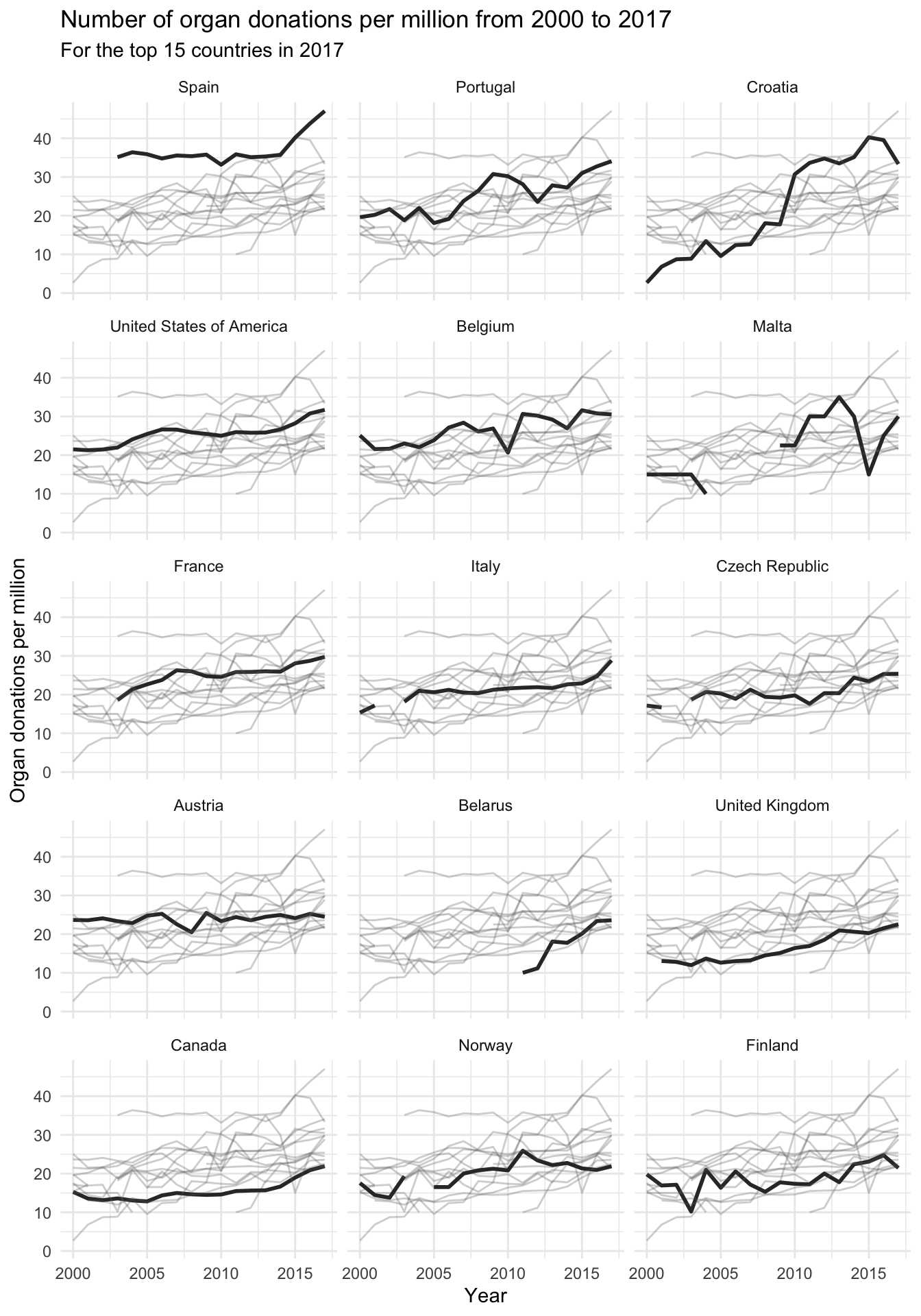
Note that we have only demonstrated the process of producing one preliminary exploratory plot and turning this exploratory figure into a few alternative polished explanatory figures. In practice, the number of preliminary exploratory figures that you will produce during EDA is substantially larger than the number of polished explanatory figures that you will produce. EDA is the drawing board stage, so there is no need to spend a lot of time ensuring that each preliminary exploratory figure that you produce is perfect. Nor do you need to create a polished explanatory version of every preliminary exploratory plot you create. You will generally do so only for the plots that you feel convey the most important information related to your project goal.
5.2 Common Explorations
Not all explorations need to be visual. Sometimes simple numeric summaries of the variables in your data can be hugely informative (and are often even clearer than a visual summary, since a single number demands a lower cognitive load to understand it than a figure does). In this section, we will present a few common numeric summaries of variables, and compare them with their visual counterparts.
All the code for producing the summaries and visualizations shown in this section can be found in the 02_eda.qmd (or .ipynb) file in the organ_donations/dslc_documentation/ subfolder of the supplementary GitHub repository.
5.2.1 A Typical Value of a Single Variable: Mean and Median
The simplest description of a variable combines all its values into a single digestible number that can be thought of as a “typical” value, such as the mean or the median. The mean (average) number of organ donations over all countries for any given year (e.g., 2017) tells you how many organ donations each country would have had if all the reported donations worldwide were distributed evenly across the countries. It can be computed as \[\bar{x}~ = ~\frac{1}{n}\sum_{i=1}^n\textrm{x}_i ~=~ \frac{1}{n}( \textrm{x}_1 + \textrm{x}_2 +...+ \textrm{x}_n),\]
where \(x_i\) corresponds to the number of organ donations for the \(i\)th country, and \(n = 194\) is the total number of countries. For example, if you have nine values: 4, 6, 12, 2, 20, 8, 9, 10, 1, the mean is equal to
\[\bar{x} = \frac{1}{9}\sum_{i=1}^9\textrm{x}_i = \frac{4 + 6 + 12 + 2 + 20 + 8 + 9 + 10 + 1}{9} = 8.\]
The median number of organ donors reported for a given year across all countries tells you how many organ donations the “middle” country had (i.e., the number of organ donations for which half of the countries had more and half had fewer). For the same nine values given previously, to calculate the median, you can arrange the numbers in increasing order: \(1, 2, 4, 6, 8, 9, 10, 12, 20\), and the median will be the middle (fifth) entry, which is 8 (if there are two middle values then the median will be the mean of these two values).
Both the mean and median are informative summaries. The mean, however, is much more sensitive (less robust) to outliers than the median. Outliers are values that are very different from the rest of a variable’s values (e.g., much larger or much smaller). For instance, if we add an extreme number, 45, to our set of nine numbers above, the mean increases from 8 to 11.7 but the median only increases from 8 to 8.5. That is, the mean is pulled much more aggressively toward the large outlying number than the median is.
For reference, the mean of the imputed donor counts per million across all countries in 2017 is \(4.7\), and the median is \(0\) (because the majority of countries did not report any donations in 2017). Note, however, that these summaries are both fairly sensitive to our judgment call to impute the missing donor counts. If we had instead computed the mean of the unimputed donor counts per million (dropping all missing values), the mean would become \(13.4\) and the median would become \(13.6\), both of which are fairly different from their imputed counterparts. However, note that the decision of whether to impute the missing donor counts is not necessarily an example of reasonable alternative judgment calls (one may be more justifiable than the other). Do you think that the imputed or unimputed computations are more in line with reality?
Other useful summaries can be derived from the quantiles of a variable. The \(q\)th quantile refers to the value for which \(q\) percent of the values are smaller and \((100 - q)\) percent are larger. The quartiles refer to the 25th quantile (1st quartile), 50th quantile (2nd quartile, also equal to the median), and 75th quantile (third quartile), and the inter quartile range (IQR) is the difference between the third and first quantiles.
5.2.1.1 Histograms and Boxplots
The most common techniques for visualizing the typical values of a single variable are histograms and boxplots. Both histograms and boxplots provide much more information about a variable than the mean and median (but keep in mind that more information is not always better, depending on your audience).
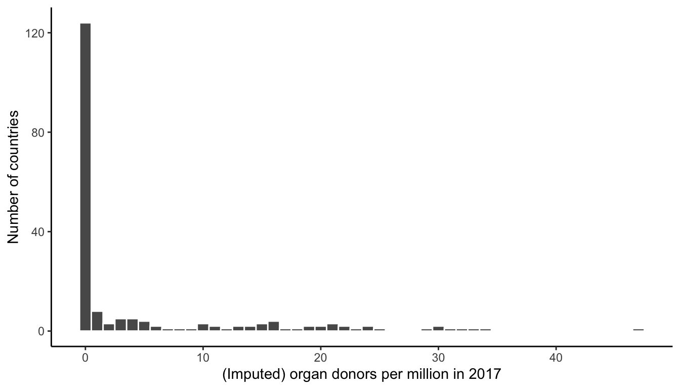
A histogram presents the number (represented by the height of the bar) of values that fall into each bin shown along the \(x\)-axis. In this example, each bin represents an interval of length 1, but they can represent larger or smaller intervals. To answer the question “What organ donation rate did a typical country have per million people in 2017?” you could create the histogram shown in Figure fig-hist-donor-dist, which shows that more than 100 countries have an imputed number of donors per million equal to 0.
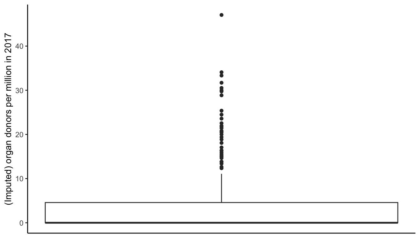
A boxplot can be used to visualize the distribution of the values of a variable based on its quartiles. In a boxplot, you will find a box whose top (assuming the boxplot is vertically oriented) corresponds to the third quartile (\(Q_3\)) and whose bottom corresponds to the first quartile (\(Q_1\)). A horizontal line is placed inside the box at the median (the second quartile, \(Q_2\)), and a line extends from the top of the box as far as \(Q_3 + 1.5 \times IQR\) or the maximum value (if \(Q_3 + 1.5 \times IQR\) is greater than the maximum) and from the bottom of the box as far as \(Q_1 - 1.5 \times IQR\) or the minimum value (if \(Q_1 - 1.5 \times IQR\) is less than the minimum). Any values that are less than \(Q_1 - 1.5 \times IQR\) or greater than \(Q_3 + 1.5 \times IQR\) are shown as points (often referred to as “outliers”). Note that while boxplots can certainly be used to visualize the distribution of a single variable, they are particularly helpful for comparing the distributions of multiple variables.
The boxplot in Figure fig-box-donor-dist conveys equivalent information to the histogram in Figure fig-hist-donor-dist, again showing that most of the donor counts are concentrated around 0 (the horizontal line corresponding to the median coincides with the bottom of the box).
Of the four exploratory answers that we have presented to answer the question “What organ donation rate did a typical country have per million people in 2017?” (the mean, the median, the histogram, and the boxplot), which would you choose to create a polished explanatory result? Recall that your answer should depend on the audience. If you are presenting these results to the general public, it would probably be clearest to make a statement involving the median and mean, such as “While most countries did not report any organ donations, the average organ donation rate across all countries is 4.7 per million.” If, however, you were instead presenting these results in a technical report or scientific paper, the histogram, which provides the most detailed view (but is slightly harder to understand), might be a more appropriate way to present these results.
5.2.2 The “Spread” of a Variable: Variance and Standard Deviation
The variance of a variable describes how much the individual values of the variable deviate from the mean, on average. The formula1 for calculating the variance of \(n\) values corresponds to the mean of the squared distance between each value and the mean of the values as follows:
\[ \textrm{Var}(x) = \frac{1}{n}\sum_{i=1}^n\Big(\textrm{x}_i - \overline{\textrm{x}}\Big)^2. \tag{5.1}\]
Recall that the mean of our previous nine-observation example was equal to 8. The variance of the nine observations (4, 6, 12, 2, 20, 8, 9, 10, 1) is thus
\[\begin{align*} \textrm{Variance} &= \frac{(4 - 8)^2 + (6 - 8)^2 + \dots + (10 - 8)^2 + (1 - 8)^2}{9} \\ & = \frac{16 + 4 + \dots + 4 + 49}{9} \\ & = 30. \end{align*}\]
The standard deviation (SD) is equal to the square-root of the variance, which is written as:
\[ SD(x) = \sqrt{\textrm{Var}(x)} = \sqrt{\frac{1}{n}\sum_{i=1}^n\Big(\textrm{x}_i - \overline{\textrm{x}}\Big)^2 }. \tag{5.2}\]
Since the variance involves computing the squared differences, when we compute its square-root we are reverting the differences back to the same “scale” as the original measurements. This is why it is commonly said that the standard deviation measures the spread on the same scale as the original measurements (whereas the variance does not). The standard deviation of the nine observations is equal to \(\sqrt{30} = 5.48\).
Two related measures that involve the absolute value difference rather than the squared differences are the median absolute deviation (MAD)2 and the mean absolute error (MAE). Equations for the MAD and MAE are given by
\[ \textrm{MAD} = \textrm{median}\Big\vert x_i - \overline{x}\Big\vert. \tag{5.3}\]
\[ \textrm{MAE} = \frac{1}{n}\sum_{i=1}^n\Big\vert x_i - \overline{x}\Big\vert. \tag{5.4}\]
When computed for the nine values (4, 6, 12, 2, 20, 8, 9, 10, 1), the MAD is 4 and the MAE is 4.2. Since the MAD and MAE involve the absolute value (rather than the squared) differences between the individual values and the mean, they are considered to be on the same scale as the original values (like the SD).
For the organ donation data, the variance of the imputed organ donation rate per million for each country in 2017 is \(78.2\), the SD is \(8.84\), the MAD is \(4.7\), and the MAE is \(6.5\). Notice that the SD, MAE, and MAD are all smaller (i.e., on a smaller scale) than the variance. Since these three metrics of spread are on the same scale as the original values (whereas the variance is squared), you can interpret the SD and the MAE as the average difference between the individual data points and the mean is \(8.84\) (for the SD) or \(6.5\) (for the MAE). You can similarly interpret the MAD as the median difference between the individual data points and the mean is \(4.7\).
The choice of metric to use to summarize the spread of a variable is a judgment call, and when there are multiple reasonable options (such as in this case), we recommend computing several metrics to obtain multiple alternative summary views.
While numeric summaries are helpful, how might you instead visualize the spread of the organ donation rates per million in 2017 across all countries? It turns out that, just like for the mean and median, this information is best gleaned from the histogram in Figure fig-hist-donor-dist and the boxplot in Figure fig-box-donor-dist (note that our exploration of spread still involves just a single numeric variable, so this fits with the flowchart presented in Figure fig-visual-flow-chart). Overall, the higher the variance/SD/MAD/MAE, the greater the spread of values in the histogram and boxplot.
5.2.3 Linear Relationships Between Two Variables: Covariance and Correlation
So far, these explorations have focused on only one single variable. Let’s shift our focus to summarizing the relationship between two variables. Correlation and covariance are two related ways of measuring the strength of a linear relationship between two variables. Two variables have a linear relationship if an increase in one variable by an amount, \(a\), is associated with an increase in the other variable by an amount proportional to \(a\). Note that this is not saying that an increase in one variable is causing an increase in the other variable. You may have heard the saying “Association does not imply causation”, which implies that there may be some external factor that is causing both variables to increase independently. If shark attacks tend to increase whenever ice cream sales increase, can we conclude that eating ice cream causes shark attacks? Of course not. A much more likely explanation is that on warmer days, more people buy ice cream and more people go into the water to swim. So the higher ice cream sales tend to co-occur with higher rates of shark attacks, but the relationship is not causal.
Linear relationships between variables can be quantified and summarized numerically by calculating how strongly two variables “co-vary” together—that is, by quantifying the extent to which larger values in one variable correspond to larger values in the other variable (this is a positive linear relationship, whereas a negative linear relationship occurs when larger values in one variable tend to correspond to lower/smaller values in the other).
The formula for the covariance between two variables, \(x\) and \(y\) (where \(x\) might be the number of organ donations and \(y\) might be the population), is given by
\[ \textrm{Cov}(x, y) = \frac{1}{n}\sum_{i=1}^n\Big(x_i - \overline{x}\Big)\Big(y_i - \overline{y}\Big). \tag{5.5}\]
Notice how similar the formula for covariance is to the formula for the variance of one variable, \(x\), which can be expanded to become
\[\begin{align*} \textrm{Var}(x) = \frac{1}{n}\sum_{i=1}^n\Big(x_i - \overline{x}\Big)\Big(x_i - \overline{x}\Big). \end{align*}\]
The variance of a variable can be thought of as the covariance of the variable with itself.
The magnitude (scale) of the covariance depends on the magnitude of the variables that it is being calculated for. This means that it is hard to compare the covariance between different pairs of variables unless all the variables have similar magnitudes.
Correlation addresses this issue by scaling the covariance using the variance of each of the individual variables so that the correlation lies between \(-1\) and \(1\). The formula for the correlation can be written as
\[ \textrm{Corr}(x, y) = \frac{\sum_{i=1}^n(x_i - \overline{x})(y_i - \overline{y})}{\sqrt{\sum_{i=1}^n(x_i - \overline{x})^2 \sum_{i=1}^n(y_i - \overline{y})^2}}, \tag{5.6}\]
and the relationship between the correlation and covariance can be written as
\[ \textrm{Corr}(x, y) = \frac{\textrm{Cov}(x, y)}{SD(x)SD(y)}. \tag{5.7}\]
A correlation of \(-1\) indicates a strong negative/inverse associational relationship (when one variable increases, the other decreases), whereas a correlation of \(1\) indicates a strong positive relationship (when one variable increases, the other does too). A correlation (or covariance) of \(0\) indicates an absence of a linear relationship between the two variables.
For an example from the organ donation project, an exploratory question that we might ask concerning a linear relationship between two variables might be “Do countries with larger populations tend to have more organ donors?” Our instincts say yes, but let’s check by computing the correlation between population and the imputed number of organ donations (for 2017). The correlation between population and the imputed number of organ donations (for 2017) equals \(0.413\), which, in this scenario, implies a weak3 positive correlation between population and number of organ donors \((0.413\) is certainly larger than 0, but it is not all that close to 1). This can be interpreted as countries with larger populations generally having more organ donations, but this trend is not particularly strong.4
Note also that the covariance between these two variables is \(50,718,459,951\), which is an absolutely meaningless number that is very large due to the large scale of the population variable.
5.2.3.1 Scatterplots
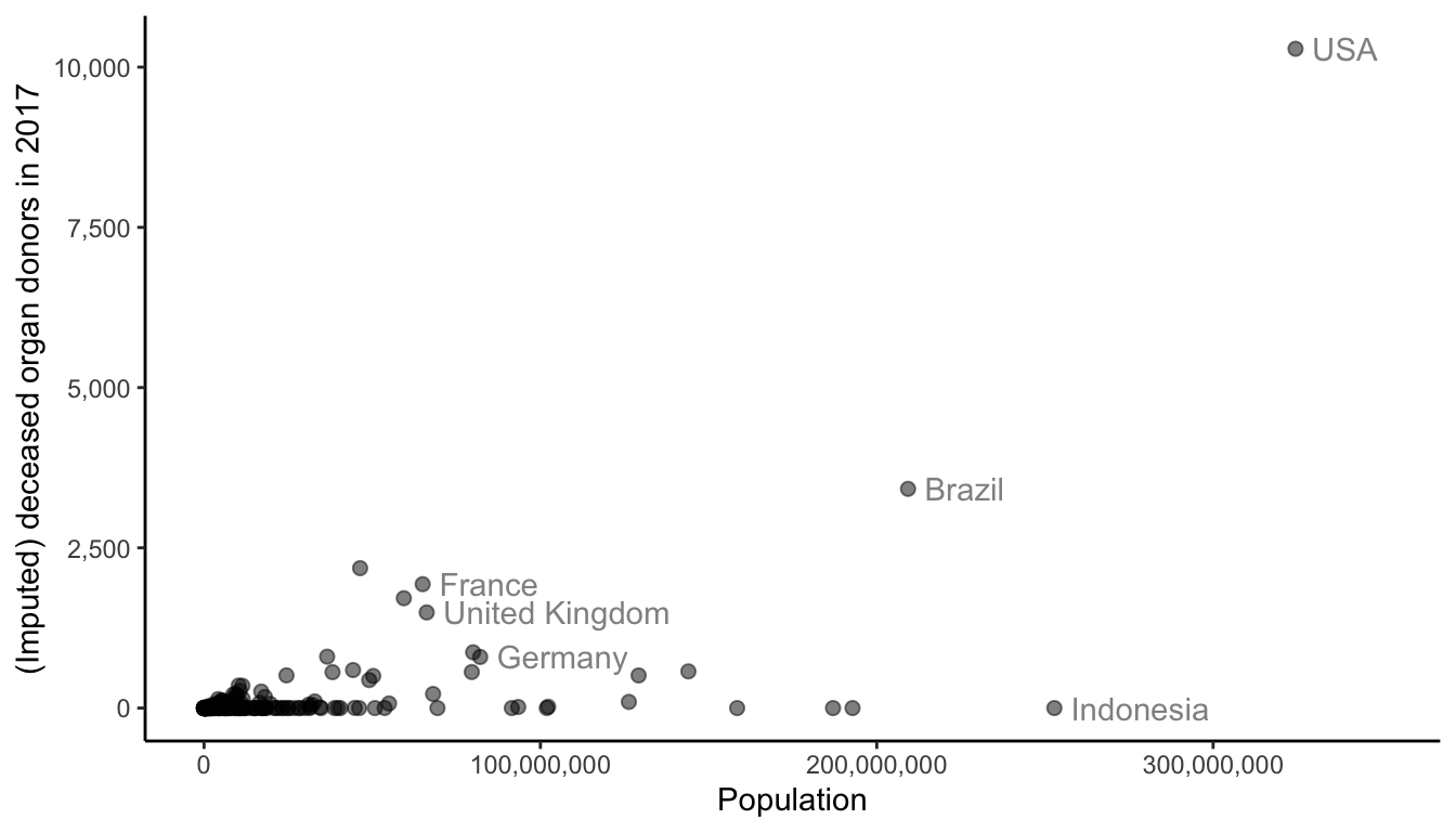
If you wanted to visualize the linear relationship between two variables (e.g., to ask “Do countries with larger populations tend to have more organ donors?”), what visualization technique would you use? This question is asking about two numeric variables: population and organ donation count, and so a scatterplot is probably a good choice (based on the flowchart in Figure fig-visual-flow-chart). Figure fig-scatterplot shows a scatterplot of population and (imputed) organ donor counts (in 2017). Each point corresponds to a country, and some countries have been annotated.
There is a strong relationship between scatterplots and correlation. If the points in a scatterplot appear to be following a linear trend, then this is indicative of a correlation between the two variables. The more tightly the points hug a line, the higher the correlation. Figure fig-correlation-scatter-diagram shows some scatterplot trends and the corresponding correlations. Note that correlation doesn’t reflect the angle of the line, but rather the tightness of the cloud of points around the line. That said, a positive angle corresponds to a positive correlation, whereas a negative angle corresponds to a negative correlation.

In the case of Figure fig-scatterplot (population versus donor count), there doesn’t appear to be much of a linear relationship. (Notice that we have tried to use transparency to reduce overplotting, but there are so many points sitting on top of one another in the lower-left corner of the plot that it isn’t very effective.) Looking at this scatterplot, it is now less surprising that the correlation between these two variables was not particularly high.
5.2.3.2 Log Scales
Whenever you have a scatterplot in which most of the data points are bunched up in one corner of the plot, with just a few points spread out into the larger values (such as in Figure fig-scatterplot), it can often help to represent one or both of the axes on a log-scale, as in Figure fig-scatterplot-log. Take note of the increments on each axis: in the original scatterplot in Figure fig-scatterplot, the ticks on the \(y\)-axis are placed at equally spaced intervals of 2,500. However, when the \(y\)-axis is presented on a \(\log_{10}\) scale, as in Figure fig-scatterplot-log, the axis ticks correspond to magnitudes of 10 (e.g., 0, 10, 100, 1,000, 10,000), which means that the actual distances between points in the lower portion of the plot are much smaller than similarly adjacent points at the top of the plot (similarly for the \(x\)-axis, which is also given a log scale in Figure fig-scatterplot-log).
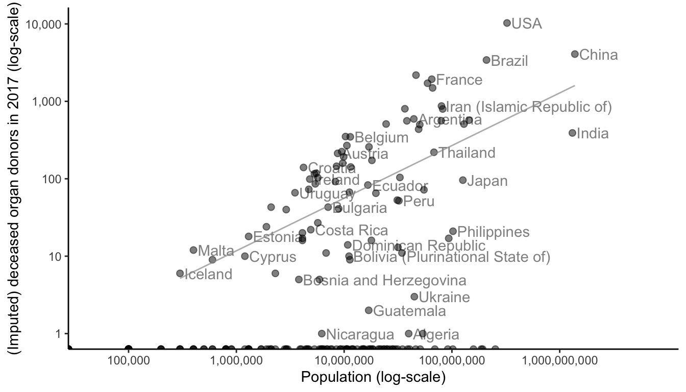
Log scales have the nice property of “spreading out” points with small values that are very close together and “bringing in” points with large values that are very far apart. Note that log-transformation cannot be computed for zero or negative numbers (rather than removing the countries with zero donations for which a \(y\)-axis log-transformation cannot be computed, in Figure fig-scatterplot-log, the \(x\)-coordinates of these zero-donation values are displayed directly on top of the \(x\)-axis).
Because the points are more spread out, there looks to be a much stronger linear relationship when the population and imputed donor count variables are viewed on a log-scale in Figure fig-scatterplot-log. We have added a trend line that plausibly summarizes this relationship. What would happen if we instead computed the correlation between the log of the population variable and the log of the imputed donor variable (where we have added a value of 1 to each count to include the zero counts in the calculation)? Surprisingly, the correlation of the log-transformed variables actually decreases to \(0.36\), but a quick exploration reveals that this is due to the presence of the countries with zero counts (the correlation is much higher if we ignore the zero counts, but doing so may paint an unrealistic picture of the data).
Note that the interpretation of a linear relationship on a log-scale is one of percentages rather than fixed amounts. Recall that for a linear relationship in a scatterplot where both axes are presented in their original scale, the interpretation is that if the population increases by some amount, \(a\), then the number of donors tends to increase by some fixed quantity proportional to \(a\) (on average). For a linear relationship in a scatterplot where both axes are presented on a log-scale, the interpretation is instead that if the population increases by \(a\) percent, the number of donors also increases, but this time by some fixed percentage (rather than quantity) proportional to \(a\) (on average).
5.2.3.3 Correlation Heatmaps
A correlation matrix corresponds to a table whose entries contain the pairwise correlations between the variables of a dataset. Correlation matrices are commonly visualized using a heatmap, such as in Figure fig-cor-heat. Note that a correlation matrix is typically a lot more informative than a covariance matrix (a table whose entries contain the pairwise covariance between the variables of a dataset), but the covariance matrix features in many mathematical formulations of algorithms.

A heatmap assigns a color to every number in a numeric dataset to visually convey their magnitude and overlays the colors onto the dataset. There are many ways to create a heatmap, including our superheat R package (Barter and Yu 2018), which implements a color map (the translation from numbers to colors) that is based on the distribution of the numbers in the data itself, and also allows you to add scatterplots, line plots, and bar charts alongside the rows and columns of your heatmap.
The heatmap in Figure fig-cor-heat shows the correlation matrix for the total deceased donor, utilized donor, kidney transplant, liver transplant, and heart transplant rate variables (where each variable is a rate computed relative to population size). From Figure fig-cor-heat, it is clear that all the variables are fairly correlated, with the total donor and utilization rates being the most highly correlated pair of variables.
5.3 Comparability
Much of EDA involves making comparisons between different values of the same variable, between two or more variables, or between summaries of a variable. Whenever you are making comparisons, it is important to compare apples-to-apples rather than apples-to-oranges.
For instance, throughout this chapter, we have typically compared the organ donation rates (per million) across different countries, rather than the donor counts themselves directly. This is because the donor numbers are inherently on the scale of the population of the country, and each country’s population is different. For example, Spain had 2,183 reported donors in 2017, whereas the US had an impressive 10,286 donors! Yet when these donor counts are viewed in the context of the population of each country, Spain has 47 donors per million people, while the US has only 31.7 donors per million people. By comparing the donor rates per million, we are making an apples-to-apples comparison (whereas comparing the donor counts directly is more of an apples-to-oranges comparison).
The principle of comparability goes beyond just ensuring that the variables or summaries that you are comparing are on the same scale. In terms of making a visual comparison, it is important to ensure that the visualization choices that you make are facilitating an apples-to-apples comparison as well. For instance, in Figure fig-spain-america-line, we present two line plots to compare the donor rates per million over time between the US and Spain.
Even though we are looking at donors per million, this visual comparison of the trends of the US’s and Spain’s numbers of donors per million is not comparing apples-to-apples. Can you figure out why?
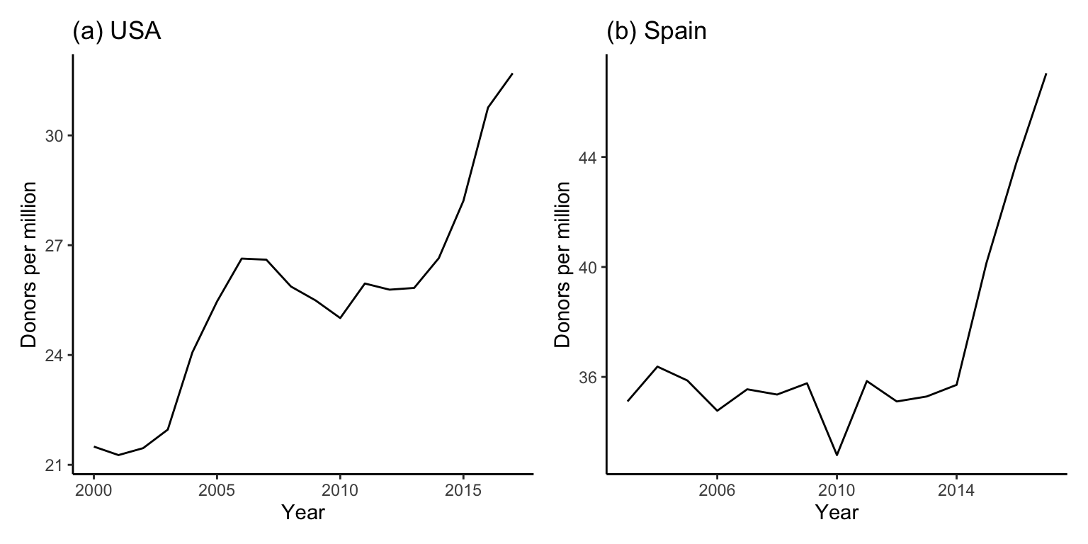
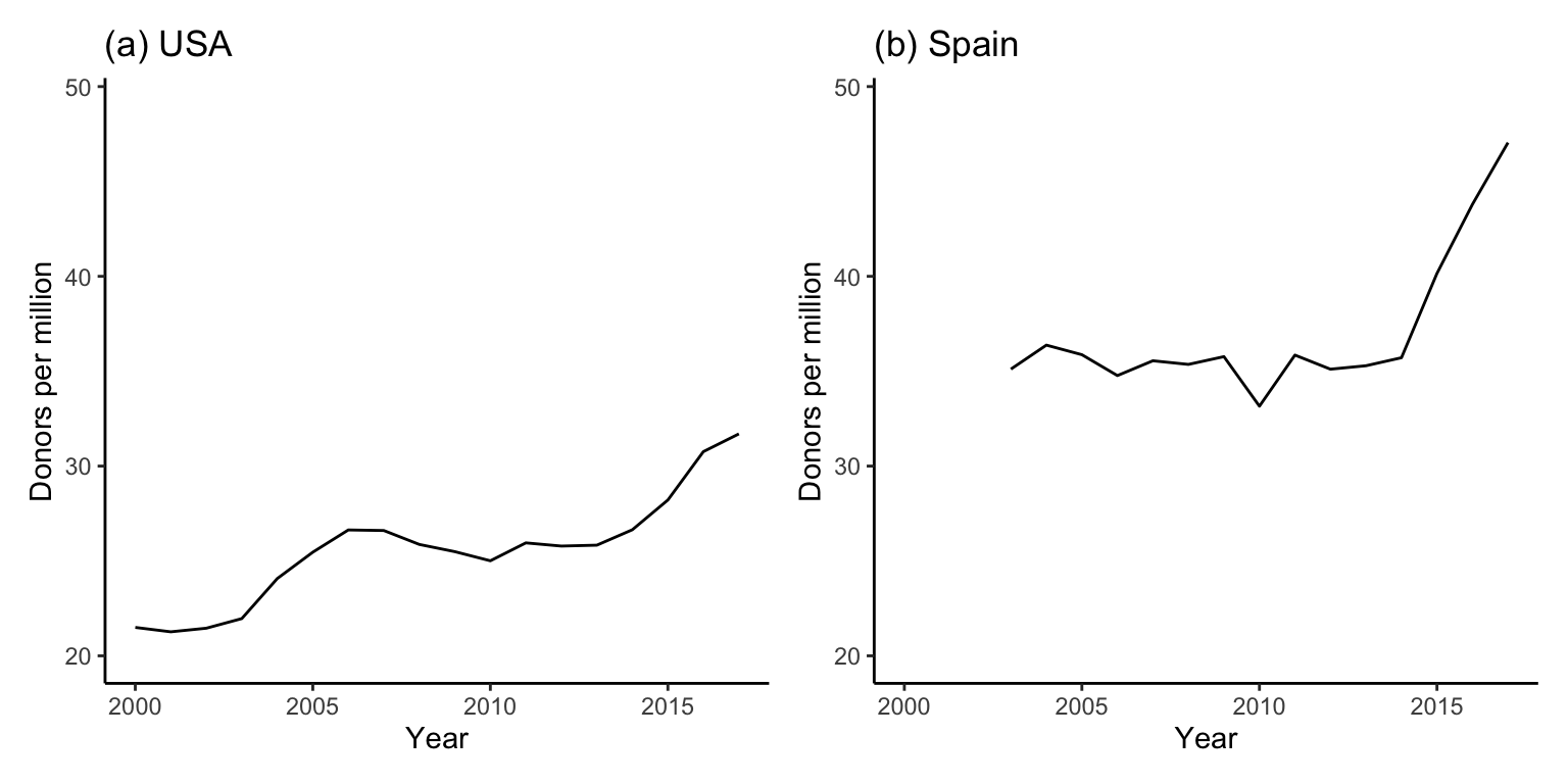
The problem is that the two line plots in Figure fig-spain-america-line have different \(x\)- and \(y\)-axis ranges. Specifically, the \(x\)-axis for Spain only starts in 2003 (due to missing values before 2003), and the \(y\)-axis ranges differ too. This gives the misleading impression that the two regions have much more similar donor rates than they actually do.
Figure fig-spain-america-line-comparable makes these line plots comparable by ensuring that the \(x\)- and \(y\)-axes have the same range. It is now much clearer that Spain has higher donor rates than the US.
This principle of comparability is important beyond just EDA, as you will see it reemerge throughout this book. For instance, many of the algorithms that we will introduce in the upcoming chapters will require that we compute distances between data points that have measurements across variables on a range of different scales. To ensure that these distances are not dominated by the variables whose measurements tend to be on a larger scale (i.e., have larger values), we typically standardize the variables (a preprocessing step) so that the distances within each variable dimension are comparable (unless the variables are already on the same scale, in which case standardization is unnecessary).
5.4 PCS Scrutinization of Exploratory Results
Before presenting any data-driven result, it is important to spend some time evaluating it using the principles of PCS (while this section focuses on PCS evaluations of a result that you wish to present to others, you also can—and should—conduct simple PCS evaluations of your preliminary explorations, such as by demonstrating that your findings do not depend on your cleaning judgment calls or your choice of chart type or color choice). Recall that to avoid data snooping, it is especially important to scrutinize the results of unguided explorations, where you are exploring the data without having a specific, particular pattern, trend, or relationship in mind (which describes most EDA explorations, if we’re being honest).
Let’s focus on scrutinizing one particular result—namely, that Spain is the world leader in organ donations—by demonstrating that this finding is predictable and stable.
5.4.1 Predictability
One way to demonstrate the predictability of the result that Spain is a world leader in organ donations would be to find external data (e.g., global organ donor data collected by a different organization) and verify that Spain is the country with the highest organ donation rate in this dataset too. In the absence of such data, another way to demonstrate the predictability of this result would be to conduct a literature search to see if there exist any other studies that conclude that Spain has the highest organ donation rate, (particularly studies based on other data sources). For this project, we took the latter approach and were quickly able to find several articles applauding Spain for being a world leader in organ donation rates, including Matesanz et al. (2017) and Rudge (2018) (although their claims appear to be based on the same data source that we have been using). However, the fact that this data-driven result reemerges in these new scenarios at all still provides us with some level of qualitative evidence that it is predictable (but not as good as if these external sources were backing up their claims with data from a different source than ours).
As additional evidence of predictability, we also showed that this finding reemerges when we use the data from 2016 instead of 2017. The code along with additional details for this predictability analysis can be found in the 02_eda.qmd (or .ipynb) file in the organ_donations/dslc_documentation/ subfolder of the supplementary GitHub repository.
5.4.2 Stability
Next, we will investigate the stability of this finding by exploring a few different sources of uncertainty. What sources of uncertainty underlie our finding that Spain is the world leader in organ donations? There are undoubtedly sources of uncertainty arising from the data collection process and the data cleaning and preprocessing stages, as well as from the data visualization stage itself. In this section, we will look at each source separately and investigate the stability of our conclusion to some reasonable perturbations designed to emulate each source of uncertainty.
5.4.2.1 Stability to Data Perturbations
To identify whether there is any uncertainty stemming from the data collection process, we can ask the following question: “Could alternative data have plausibly been collected using the same data collection protocol?” Since every country is already included in the data (even if some country’s data are missing), it would not have been possible to have observed the donor trends of a different set of countries (i.e., there is no “sampling” uncertainty). However, it is potentially plausible that the numbers in the reported donor counts themselves could have been slightly different; for instance, if the organ donor counts for some countries were not exact (perhaps due to a lack of organized organ donation reporting protocols in hospitals leading to some organ donations not being recorded or others being duplicated). This type of measurement error, if it exists at all, is likely to be fairly small. However, let’s conduct a brief investigation of this postulated data collection uncertainty by exploring whether perturbing some of the donor count measurements changes our conclusion.
Specifically, we will perturb the data by adding some “noise” (random numbers) to some of the donor counts. There are many ways that we could do this (which, technically, involves a judgment call), but for this analysis, we decided to add a random Gaussian (normal) number to some proportion, say 30 percent, of the donor counts (where we chose an arbitrarily—but fairly large—proportion here to create a reasonably extreme perturbation). The random numbers that we add are equal to zero on average and have a standard deviation equal to the standard deviation of the relevant country’s imputed donor counts (to ensure that the noise has an appropriate scale relative to the country’s donor counts). This perturbation is likely to be far more extreme than the actual uncertainty that underlies the donor count measurements, but if our conclusions are stable to these perturbations, then it is likely that they would be stable to the actual uncertainty too.
To investigate how much our key finding in Figure fig-lines-highlight-clean(a) changes as a result of our data perturbations, we create four versions of the perturbed dataset and overlay the four perturbed trend lines (dashed lines) over the original trend lines (solid lines) in Figure fig-lines-highlight-perturb.5 Spain’s trend lines are highlighted in purple. Fortunately, even with 30 percent of the organ donor counts perturbed, Spain is consistently the world leader in deceased organ donations, indicating that this conclusion is fairly stable even to these fairly extreme data perturbations.

5.4.2.2 Stability to Cleaning and Preprocessing Judgment Call Perturbations
Next, we will examine the inevitable uncertainty that arises from the judgment calls that we make during the data cleaning and preprocessing steps. The first step is to identify any judgment calls that we made during these stages that might have influenced our results. Next, we can conduct some stability assessments to try to visualize the uncertainty arising from these judgment calls (i.e., we will investigate whether these judgment calls impact our findings in any substantial way).
One key preprocessing judgment call that we made was to present this particular chart using the original unimputed values rather than using the imputed donor counts. However, when we remake Figure fig-lines-highlight-clean(a) using each of the alternative imputation techniques (not shown), we continue to find that Spain is the world leader in organ donation rates. This analysis can be found in the 02_eda.qmd (or .ipynb) file in the organ_donations/dslc_documentation/ subfolder of the [supplementary GitHub repository(https://github.com/Yu-Group/vds-book-supplementary).
5.4.2.3 Stability to Data Visualization Judgment Call Perturbations
Finally, let’s explore the uncertainty arising from the judgment calls that we made when choosing how to visualize our findings. Specifically, let’s investigate whether our findings from Figure fig-lines-highlight-clean(a) are stable to alternative plausible visualization judgment calls that we could have made.
Let’s consider just two of the judgment calls that we made:
Filtering to the top 20 countries in 2017 to make the plot look tidier.
Choosing to use a multiline chart to compare the organ donation trends.
For the judgment call to filter to the top 20 countries in 2017, what are some alternative judgment calls that we could have made? Alternative judgment calls that we could have made include not filtering the data at all (i.e., including all countries); filtering just to the countries that had at least one year with 500 reported donations; or filtering to the countries that had at least one year with a donor rate of at least 20 donors per million.
Figure fig-line-spain-compare reproduces Figure fig-lines-highlight-clean (highlighting Spain only) under each of these judgment calls. Overall, the conclusions are the same (Spain continues to appear to be the global leader in organ donation trends), but you could argue that by including more countries in panel (a), Spain’s achievements seem more impressive (i.e., the magnitude of our conclusion changes). The difference in our interpretation is not drastic, however, so overall the results seem fairly stable to our filtering judgment call.

Next, let’s examine the stability of our conclusions to our judgment call to use a multiline chart. How else could we visualize this data? This original judgment call was based on the idea that the year variable should be treated as a continuous time-based variable. One option is to reformat the data so that the donor rate for each year is treated as a separate variable (i.e., we have many numeric variables that we want to visualize). In this case, the flowchart in Figure fig-visual-flow-chart indicates that a heatmap might be helpful. Figure fig-heatmap shows a heatmap of the deceased organ donation rate from 2010 to 2017 for the 20 countries with the highest donor rates in 2017, arranged in order from the most to the fewest donations in 2017.
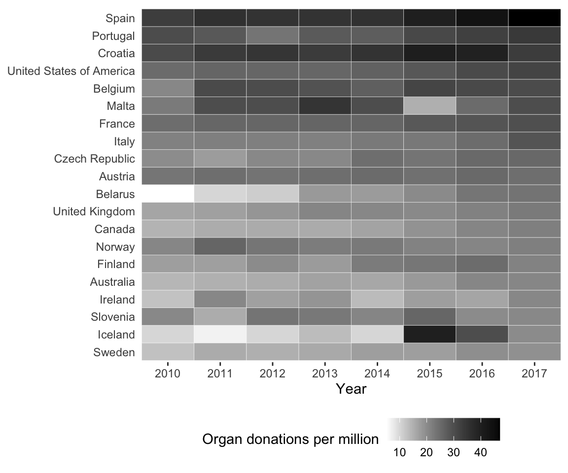
Does your impression of the trends in the data change when you view this information in a heatmap, rather than as in a multiline plot in Figure fig-lines-highlight-clean(a)? In our opinion, the heatmap in Figure fig-heatmap does not highlight Spain’s dominance as clearly as the multiline plot in Figure fig-lines-highlight-clean(a), but it does present the ranking of each country much more clearly. The heatmap also makes it easier to see any outlier values (such as Iceland’s 2015 donor rate and Malta’s 2013 and 2015 donor rates). Relative to the multiline plot, it is much harder to identify the specific values of the donor rates for individual cells in the heatmap (whereas it is easy to trace the height of a line to the \(y\)-axis in the line plot). That said, the general conclusion that Spain has the highest organ donation rates in the world does seem to be stable to our choice of visualization technique.
These are just a few examples of PCS-based explorations that we could have conducted to evaluate our conclusion that Spain is a world leader in organ donation rates. These explorations are certainly not exhaustive (you will find a few more examples of PCS explorations in the exercises at the end of this chapter), but they provide some fairly clear evidence about the trustworthiness of our conclusion that Spain is a world leader in organ donations. Recall that you are not expected to explore every possible alternative avenue in your PCS analyses; rather, you are encouraged to choose a few different explorations and stress tests to conduct. The code for the explorations that we conducted can be found in the 02_eda.qmd (or .ipynb) file in the organ_donations/dslc_documentation/ subfolder of the supplementary GitHub repository.
In conclusion, for every exploratory journey that you embark upon, the eventual stories that you choose to tell—and the way that you choose to tell them—are up to you and will depend on the domain, your audience, and the specific takeaway message that you are trying to convey. Your job is to ensure that you are telling the story that is most relevant to the overall goal of the project, and that you have made a reasonable effort to find and document evidence that your results are predictable and stable before presenting them to others.
Exercises
True or False Exercises
For each question, specify whether the answer is true or false (briefly justify your answers).
You should evaluate the predictability and stability of every explanatory finding that you present.
Not every exploratory finding needs to be turned into an explanatory figure.
Exploratory and explanatory data analyses can be numeric summaries (i.e., are not only data visualizations).
It is a good idea to add color to a plot, even when the color does not convey information.
The correlation between two numeric variables describes the angle of the linear relationship in a scatterplot.
Correlation only quantifies the linear component of the relationship between two variables.
The mean is a better summary of a typical value than the median when there are outliers present.
When deciding between multiple possible versions of an explanatory figure, you should always choose the one that conveys more information (i.e., is more detailed).
If one variable causes changes in the other, then the two variables will be correlated.
If one variable is correlated with another, then changes in one will cause changes in the other.
Conceptual Exercises
Explain how you could use a scatterplot to visualize two numeric variables and a categorical variable simultaneously.
What is “overplotting”? Describe two techniques for reducing overplotting in a figure.
Explain the difference between an exploratory and an explanatory plot.
What is the relationship between correlation and covariance? Explain why the correlation provides a more comparable summary of the linear relationship between two numeric variables than the covariance.
Describe two ways that you could demonstrate the predictability of a conclusion drawn from a data visualization.
This question asks you to identify an appropriate visualization technique for visualizing various relationships in the organ donation data. You may want to use the data visualization flowchart in Figure fig-visual-flow-chart to identify possible visualization types, but don’t feel constrained by it (keep in mind that there may be several appropriate visualization choices). To help recall what the data looks like, we have printed the relevant variables for Australia, Italy, and Germany from 2014–2017 in the following table (but your visualizations should be based on the entire dataset).
What visualization technique would you use to visualize the number of countries in each region? Draw a brief sketch of what your visualization would look like or create it in R/Python.
What visualization technique would you use to visualize the total number of organ donations in 2017 for each region? Draw a brief sketch of what your visualization would look like or create it in R/Python.
What visualization technique would you use to visualize the number of organ donations over time in Europe? Draw a brief sketch of what your visualization would look like or create it in R/Python.
| country | region | year | population | total_deceased_donors_imputed |
|---|---|---|---|---|
| Australia | Western Pacific | 2014 | 23600000 | 378 |
| Australia | Western Pacific | 2015 | 24000000 | 435 |
| Australia | Western Pacific | 2016 | 24300000 | 503 |
| Australia | Western Pacific | 2017 | 24500000 | 510 |
| Germany | Europe | 2014 | 82700000 | 864 |
| Germany | Europe | 2015 | 80700000 | 877 |
| Germany | Europe | 2016 | 80700000 | 857 |
| Germany | Europe | 2017 | 82100000 | 797 |
| Italy | Europe | 2014 | 61100000 | 1384 |
| Italy | Europe | 2015 | 59800000 | 1369 |
| Italy | Europe | 2016 | 59800000 | 1478 |
| Italy | Europe | 2017 | 59400000 | 1714 |
The following set of two boxplots aim to compare the distribution of the 2017 organ donation rates between the American and European countries.
It is not specified whether these boxplots are representing the imputed or unimputed donor counts. Which variable do you think makes more sense for this comparison? Why?
Do you think that these two boxplots are comparable? If not, how would you modify them so that they are?

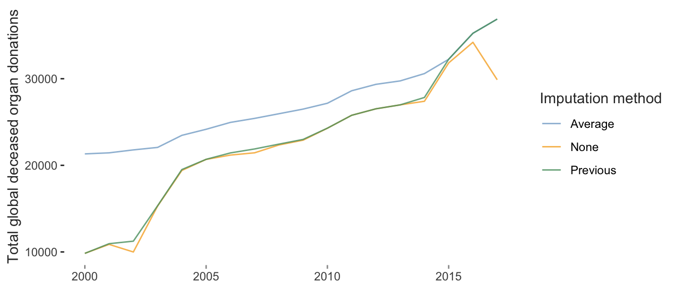
The following plot shows a stability analysis of an EDA finding related to the increase in the total number of organ donations worldwide over time. This analysis shows how this result changes based on the preprocessing imputation judgment call options that we introduced in sec-cleaning (no imputation, average imputation, and previous imputation).
Based on this plot, do you feel that the global organ donation trend result is stable to the choice of imputation judgment call?
Do you think that all three of these choices are reasonable alternative judgment calls? If not, which do you think is the best choice?
- The plot below is an exploratory figure that demonstrates that the proportion of organ donations that were utilized (i.e., were actually transplanted) is higher in the US than in Spain. Describe how you would create a polished explanatory figure that conveys this message as clearly and effectively as possible. Explicitly state your target audience. Get creative: your explanatory figure does not have to simply be a polished version of this plot (but it can be if you’d like). For a challenge, create your explanatory figure in R or Python.

Here, we present two potential visualizations of organ donation rates by country in 2017 using (a) a map (a visualization type that does not feature in the flowchart), and (b) a bar chart.
List at least two pros and cons of each visualization option for conveying this information.
Which chart would you choose for presenting in a pamphlet that will be distributed to the public? Justify your choice.
Which chart would you choose for presenting in a technical report that will be reviewed by domain experts? Justify your choice.
For the map in panel (a), identify one data visualization judgment call that we made when producing this plot that may have an impact on its takeaway message.

Mathematical Exercises
Suppose that two variables, \(x\) and \(y\), have an approximately linear relationship that can be summarized mathematically as \(y = 2 + 4x\).
Draw the line \(y = 2 + 4x\) on a blank plot with axes \(x\) and \(y\) (either manually using pen and paper or using R or Python).
Based on this linear relationship, how much does \(y\) increase when \(x\)’s value is increased by \(1\)? (Hint: try replacing \(x\) with \(x + 1\) in the summary linear relationship given in this question.)
If we log-transform both \(x\) and \(y\) so that our relationship is now \(\log(y) = 2 + 4\log(x)\), how much (in terms of a percentage of its original value) does \(y\) increase when \(x\) is increased by 1 percent (i.e., when \(x\) becomes \(1.01x\))?
You are given the following 12 numbers: \[(x_1, x_2, ..., x_{12}) = (12, ~2, ~ 10, ~ 6, ~8, ~ 7, ~6, ~2, ~ 5, ~5, ~ 7, ~0).\]
Compute the mean and the median of \(x\) (manually).
Add the number 25 to the collection of numbers (so there are now 13 numbers). Recompute the mean and median. Comment on how much each value changed.
Compute the variance and standard deviation of \(x\) (manually). Note that most programmed functions will use a version of the formula for the variance that has a denominator of \(n-1\) instead of \(n\).
You are given another set of 12 numbers: \[(y_1, y_2, ..., y_{12}) = (120, ~51,~ 96,~ 72,~ 91,~ 81,~ 99, ~ 50, 52,~ 68,~ 63,~ 55).\]
Compute the mean and the median of \(y\) (manually).
Compute the variance and standard deviation of \(y\) (manually). Note that most programmed functions will use a version of the formula for the variance that has a denominator of \(n-1\) instead of \(n\).
Create a scatterplot of \(x\) (the 12 numbers from the previous question) against \(y\) (the set of 12 numbers from this question) either manually using pen and paper or using R or Python.
Based on the scatterplot you created, what kind of correlation do you expect to find between \(x\) and \(y\)?
Compute the correlation and the covariance between \(x\) and \(y\) (we recommend doing this computation manually). Comment on how you interpret your results.
Prove the following relationship between the correlation and covariance: \[\textrm{Corr}(x, y) = \frac{\textrm{Cov}(x, y)}{SD(x)SD(y)}.\]
Coding Exercises
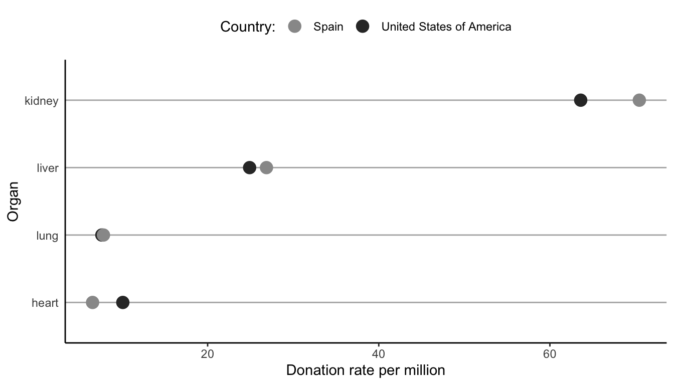
A dot plot is a visualization technique for comparing the values of comparable numeric variables (such as the donation rates for each organ) across a grouping variable (such as country).
Although there is no inbuilt function in the ggplot2 R library or in Python for creating dot plots, a dot plot can be produced with the creative use of the
geom_point()andgeom_line()ggplot2 R functions (or equivalent scatterplot functions in Python, such as thepx.scatter()plotly function). Use these functions to create your own version of the following dot plot that summarizes the donation rates of kidneys, livers, lungs, and hearts for Spain and the US in 2017. The code that creates the data that underlies this plot can be found at the end of the02_eda.qmd(or.ipynb) file in theorgan_donations/dslc_documentation/subfolder of the supplementary GitHub repository.Summarize a take-away message for the dot plot.
For this question, you will conduct your own EDA in R or Python for the organ donor project based on the exploratory prompt: “Is there a difference in deceased donor type (i.e., whether the organs come from brain death or circulatory death donors) across different countries?” The relevant variables in the preprocessed organ donation data will be
deceased_donors_brain_deathanddeceased_donors_circulatory_death. You can conduct your analysis in the relevant section of the online EDA code can be found in the02_eda.qmd(or.ipynb) file in theorgan_donations/dslc_documentation/subfolder of the supplementary GitHub repository.Run the organ donations EDA code in
02_eda.qmd(or.ipynb).To conduct your EDA to answer the question (“Is there a difference in deceased donor type (i.e., whether the organs come from brain death or circulatory death donors) across different countries?”), you may want to just focus on a few countries that are of interest to you (easier) or you may want to look at all countries (harder). You may also want to focus on the data from one particular year (easier) or include all the years in your analysis (harder). Since these variables contain many missing values, you may want to impute them or restrict your analysis to just a subset of countries and years for which the data is not missing. Be sure to document any judgment calls that you make and justify your choices.
Conduct a PCS evaluation of at least one of your findings.
Create at least one polished explanatory plot based on your exploratory findings. Be sure to choose a clear take-away message, and ensure that your explanatory plot highlights this message.
- For the organ donation project, add at least one additional exploration section to the
02_eda.qmd(or.ipynb) file in theorgan_donations/dslc_documentation/subfolder of the supplementary GitHub repository based on a question that you come up with on your own, conduct a PCS evaluation of your findings, and create at least one polished explanatory visualization based on what you find.
EDA Project
Re-evaluating growth in the time of debt This project continues with the “growth in the time of debt” project from sec-cleaning in which you cleaned the historical public debt data downloaded from the International Monetary Fund (IMF) and the gross domestic product (GDP) growth data from the World Bank. The data and template files can be found in the
exercises/growth_debt/folder in the supplementary GitHub repository.Create a new DSLC code file in which to conduct an EDA based on a project goal similar to Reinhart and Rogoff’s original study, which aims to identify whether higher debt is associated with lower economic growth.
Conduct a PCS evaluation of your findings.
Produce at least one explanatory figure communicating an interesting finding from the data to an audience of your choosing.
References
Most software will use a slightly different formula for the variance, which divides the squared differences by \(n-1\) rather than \(n\): \(\textrm{Variance} = \frac{1}{n-1}\sum_{i=1}^{n}(\textrm{x}_i - \overline{\textrm{x}})^2\). The reason for this is based on theoretical results that show that the version with the denominator of \(n-1\) is unbiased for the “population” variance, which we won’t discuss here.↩︎
Note that the acronym MAD is sometimes used to refer to the “Mean Absolute Deviation,” which corresponds to what we are calling the MAE.↩︎
The interpretation of whether a particular correlation indicates a strong/weak relationship will depend on the context. For instance, in some applications, such as in neuroscience, a correlation of \(0.413\) is considered to be a perfectly reasonable (and perhaps even strong) correlation, but in other situations, it might be considered fairly weak.↩︎
Note, however, that the presence of a large number of donor counts that are exactly equal to 0 makes the interpretation of this correlation slightly nonstandard, but we consider it to still be useful (Huson 2007).↩︎
To reduce overplotting, we filter to the countries that have at least one year with 500 donations.↩︎