
9 Continuous Responses and Least Squares
This is the Open Access web version of Veridical Data Science. A print version of this book is published by MIT Press. This work and associated materials are subject to a Creative Commons CC-BY-NC-ND license.
In this chapter, we will introduce two algorithms for predicting continuous responses using the Ames house price prediction project as an example. Recall that our goal for this project is to predict the sale price of houses in Ames that are for sale in the year 2011.1
The two algorithms we will introduce in this chapter, Least Absolute Deviation (LAD) and Least Squares (LS), both aim to quantify the linear relationship between a response variable and the predictor variables. Before we get started, however, it can be helpful to first visualize these relationships to get a sense of how a line can be used to quantify them and, subsequently, to generate predictions.
9.1 Visualizing Predictive Relationships
A good place to start any predictive journey is to visualize the response that you’re trying to predict together with a potential predictor variable. Recall that, in general, a feature will be a good predictor of a response if its value can tell us something about the response’s value. For instance, if houses with a larger living area tend to sell for more, then the living area is likely to be a good predictor of the sale price. If this relationship also seems to be fairly constant regardless of the size of the house (i.e., houses whose living area is larger by \(x\) square feet tend to sell for an additional amount that is proportional to \(x\), no matter what the original living area is), then this relationship is approximately linear. How can you tell if two variables (such as a response variable and a predictor variable) have a linear relationship? You can visualize them using a scatterplot!
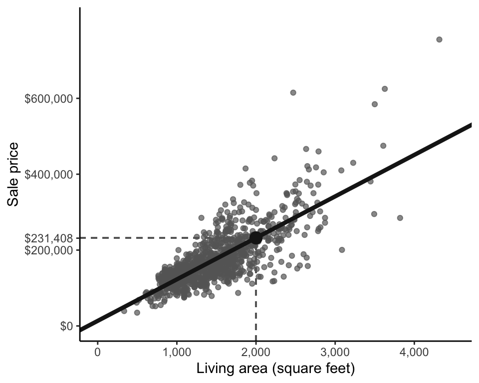
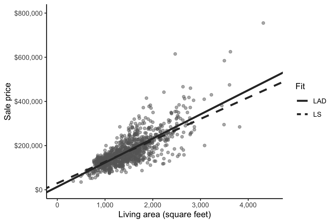
Figure fig-price-area shows a scatterplot of sale price against living area for the houses in the training data. From the scatterplot, it is immediately clear that houses with larger living areas tend to sell for more (there is a positive slope to the cloud of points), and the sale price seems to increase along with living area at a reasonably consistent rate (the cloud of points generally follows a straight line). This indicates that there is an approximate positive linear relationship between living area and sale price (a negative linear relationship would be if sale price tended to decrease with living area at a relatively constant rate).
Note, however, that this observation says nothing about a causal relationship between living area and sale price (i.e., we are not trying to claim that increasing the size of a house causes it to sell for more). We are simply observing that larger houses tend to sell for more (i.e., house price is associated with size). This is a subtle but important distinction. The latter interpretation allows for the possibility that an external factor is causing both the houses to be larger and the houses to sell for more. For instance, perhaps houses that are of a particular style tend to both be larger and more expensive, but rather than it being the size of the houses that drives the prices up, it is the style of the houses. In this example, house style is a confounder: a common cause of increases in both size and price.
How might we summarize this associational linear relationship between sale price (response) and living area (predictive feature)? Perhaps we can place a line through the cloud of points, similar to the linear summaries that we produced when we conducted principal component analysis in sec-dimension-reduction. Figure fig-price-area-with-fit shows one possible fitted line that seems to capture the linear relationship between sale price and living area fairly well. But is this the “best” fitted line for generating predictions of sale price?

For prediction problems, the fitted line we seek has a different goal from the line we sought for the first principal component. Recall that our goal when computing the first principal component was to summarize all the variables in the data without explicitly prioritizing any particular variable over another. For prediction problems, however, our goal is to find the line that most accurately predicts the response variable (i.e., sale price, for this example). Before we can understand how to identify such a line, we need to explain how to use a fitted line (such as that shown in Figure fig-price-area-with-fit) to generate response predictions in the first place.
9.2 Using Fitted Lines to Generate Predictions
How can a fitted line representing the relationship between living area and sale price be used to predict the sale price of a new house based on its living area? Let’s demonstrate with an example. Imagine that you have a 2,000-square-foot house. In Figure fig-price-area-predict, trace your finger vertically from the \(x\)-axis position of 2,000 square feet until you meet the fitted line (we’ve placed a vertical dashed line on the plot to help you), and identify what the \(y\)-axis (vertical) position of your finger is (the horizontal dashed line will show you the \(y\)-axis position). This will be the predicted sale price of the 2,000-square-foot house, which in this case is $231,408.
Since any fitted line between two variables, \(x\) and \(y\), can be written in the form \(y = b_0 + b_1x\), we can write our fitted line (where the predicted price response is the \(y\)-coordinate and the living area is the \(x\)-coordinate) as follows:
\[ \textrm{predicted price} = b_0 + b_1 \times \textrm{area}. \tag{9.1}\]
In this linear equation, \(b_0\) and \(b_1\) are the parameters of the fitted line:
\(b_0\) is the intercept of the line. The intercept is the “starting” prediction value and it corresponds to the position on the \(y\)-axis where the fitted line crosses it. For our house sale price example, the intercept is the predicted sale price for an imaginary house that is 0 square feet. That is, the predicted price starts at \(b_0\) and increases from there proportionally to the living area of the house.
\(b_1\) is the coefficient of the predictor variable (\(b_1\) is also the slope of the line). For the house price example, \(b_1\) is the amount by which the predicted price increases with every additional square foot of living area (the predictor variable).
The fitted line shown in Figure fig-price-area-predict can be written as
\[ \textrm{predicted price} = 13,408 + 109 \times \textrm{area}, \tag{9.2}\]
where the predicted sale price starts at \(b_0 = 13,408\) and increases by \(b_1 = 109\) for every additional square foot of living area.
A price prediction for a 2,000-square-foot house can be computed by plugging “\(\textrm{area} = 2,000\)” into Equation eq-ls-first-fit, which gives
\[\textrm{predicted price} = 13,408 + 109 \times 2,000 = 231,408,\] as shown in Figure fig-price-area-predict.
9.3 Computing Fitted Lines
The fitted line in Figure fig-price-area-predict is just one of many possible lines that we could have shown. How did we choose the coefficient values of \(b_0 = 13,408\) and \(b_1 = 109\)? Are there other values of these parameters that might lead to better predictions?
For the task of generating accurate predictions, some fitted lines will do a better job than others. An ideal fitted line for generating predictions is one where the corresponding predicted responses from the line are as close to the observed responses as possible (i.e., the predictions it generates are accurate). For our sale price prediction problem, data points whose sale price \(y\)-coordinate is close to the corresponding \(y\)-coordinate of the fitted line (for the relevant \(x\)-coordinate position) are considered to have accurate predictions. Notice that since our response variable (sale price) is represented using the \(y\)-axis, the accuracy of our response predictions depends only on the \(y\)-coordinate differences (or the vertical projection distance) between the data points and the fitted line. This is in contrast to principal component analysis, where we were instead interested in the perpendicular projection distance (rather than the vertical projection distance).
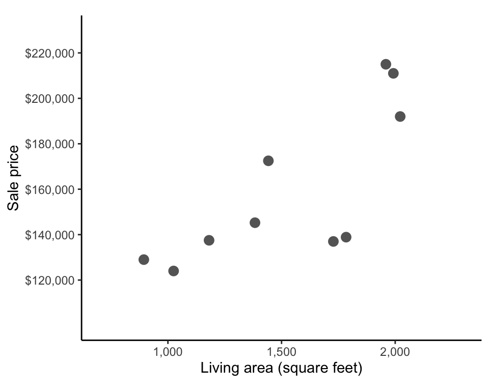
How can we identify which line will have the shortest possible average vertical distances from each point to the line? Let’s start small by thinking about how to compute such a line for the sample of 10 houses from Table tbl-clean-ames in sec-prediction-intro. These houses are shown in the living area (\(x\)) versus sale price (\(y\)) scatterplot in Figure fig-sale-price-vs-area-sample.
Our goal is to identify the fitted line for which the difference between the predicted prices (\(y\)-coordinate of the line) and observed prices (\(y\)-coordinate of the points) are as small as possible. However, as usual, there are multiple ways that we could choose to define this “difference.”
9.3.1 Least Absolute Deviation
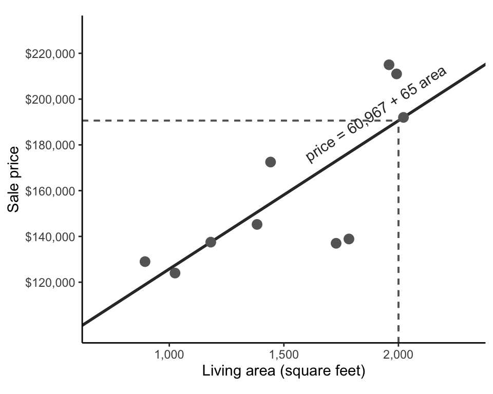
Let’s start with a very intuitive measure of difference for this problem: the absolute value difference (which is like a one-dimensional version of the Manhattan distance). Consider just the first house in the sample of 10 houses which was a 1,959-square-foot house that sold for $215,000. If the predicted sale price of this house was $227,680, then the absolute value difference between the observed and predicted prices would be \(\vert 215,000 - 227,680\vert = 12,680\). Figure fig-sale-price-area-sample-vertical-fit shows these absolute value differences as vertical dashed lines. Our goal is thus to find the line for which the absolute value differences between the observed and predicted response are as small as possible when averaged across all our data points.

The quantity we need to minimize to compute this line is called the objective function or the loss function (and is similar in vein to the loss function we saw for the K-means algorithm in sec-clustering). The term “loss” reflects the fact that it measures what you lose when you make the prediction (i.e., how different your predictions are from the observed values). In this example, we are minimizing the absolute value loss (often called the \(L1\) loss by the more mathematically inclined), which corresponds to the average (or sum) of the absolute differences between the observed responses and the predicted responses across all the data points. The absolute value loss can be written as
\[ \frac{1}{n} \sum_{i = 1}^{n}\Big\vert \textrm{observed response}_i - \textrm{predicted response}_i \Big\vert, \tag{9.3}\]
where the \(\textrm{observed price}_i\) and the \(\textrm{predicted price}_i\) correspond to the observed and predicted prices for the \(i\)th data point in the training dataset (with \(i\) ranging from \(1\), \(2\), \(3\), …, \(n\), where \(n\) is the number of data points in the training dataset).
The algorithm that computes the line that minimizes the absolute value loss is called Least Absolute Deviation (LAD) (Box box-lad).
Since our predicted response can be written in the form of \(\textrm{predicted price} = b_0 + b_1 \times \textrm{area}\), this means that for this particular problem, the LAD algorithm aims to find the values of the coefficients, \(b_0\) and \(b_1\), such that the absolute value loss is as small as possible. The absolute value loss for this particular line can thus be written in terms of \(b_0\) and \(b_1\) as
\[ \frac{1}{n} \sum_{i = 1}^{n}\vert \textrm{observed price}_i - (b_0 + b_1 \times \textrm{area}_i)\vert. \tag{9.4}\]
For a general training dataset with observed responses \(y_1, ..., y_n\) and predictor variable values of \(x_1, ..., x_n\), the absolute value loss function for generating predicted responses of the form \(b_0 + b_1 x_i\) can be written as
\[ \frac{1}{n} \sum_{i = 1}^{n}\vert y_i - (b_0 + b_1 x_i)\vert. \tag{9.5}\]
Now that we have narrowed our task to identifying which values of \(b_0\) and \(b_1\) will lead to the smallest absolute value loss, how do we actually do that? Normally, this would be a straightforward calculus problem, but since the absolute value loss function is not differentiable at its minimum, things are a little more complicated (since this means that there is no general formula into which we can plug our data to get the values of \(b_0\) and \(b_1\) that lead to the smallest absolute value loss).
All hope is not lost, however. An alternative way to find reasonable values of \(b_0\) and \(b_1\) is to plug a variety of potential \(b_0\) and \(b_1\) values into the absolute value loss function in Equation eq-absolute-loss-plugin, and then choose the values of \(b_0\) and \(b_1\) that lead to the smallest loss. While this procedure would be fairly tedious to do manually (especially as you may want to try hundreds or thousands of values of each \(b_0\) and \(b_1\)), it could be done reasonably efficiently using a computer. Fortunately, there are several computational methods for finding parameter values that approximately minimize loss functions (Barrodale and Roberts 1973). However, because our solution will be approximate, this typically means that our identified LAD coefficients will not necessarily be unique.
Using R (specifically using the lad() function from the L1pack R package by Osorio and Wolodzko (2022) and setting the argument method = "EM"; Python users can instead use the linear_model.LADRegression() class from the sklego library), we computed the values of \(b_0 = 60,967\) and \(b_1 = 65\) as potential (approximate) solutions to the LAD optimization problem for this sample of 10 training houses. This LAD-fitted line can thus be written as
\[ \textrm{predicted price} = 60,967 + 65 \times \textrm{area}. \tag{9.6}\]
The code for computing these coefficients can be found in the 04_prediction_ls_single.qmd (or .ipynb) file in the relevant ames_houses/dslc_documentation/ subfolder of the supplementary GitHub repository.
This fitted line is shown in Figure fig-sale-price-area-sample-lad. If we want to use this line to generate a sale price prediction for a 2,000-square-foot house, we could plug 2,000 into the “area” variable of Equation eq-lad-fitted-10—that is, \(\textrm{predicted price} = 60,967 + 65 \times 2,000 = 190,967\). This prediction is shown in Figure fig-sale-price-area-sample-lad using dashed lines.
9.3.2 Least Squares
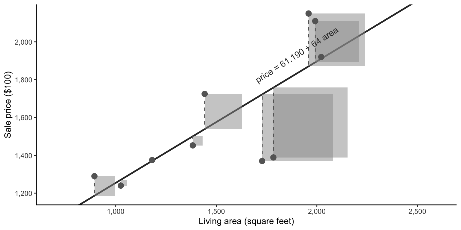
The absolute value loss is just one possible way that we could have defined our loss when setting up our prediction optimization problem. What if instead of using the absolute value difference, we instead used the squared difference (i.e., a 1-dimensional version of the squared Euclidean \(L2\) distance)? This would mean that we are choosing the line that minimizes the squared loss instead of the absolute value loss. The squared loss, based on \(n\) training data points, can be written as
\[ \frac{1}{n} \sum_{i = 1}^{n}( \textrm{observed response}_i - \textrm{predicted response}_i )^2. \tag{9.7}\]
If we are generating predicted responses of the form \(b_0 + b_1 x_i\) (where \(x_i\) denotes the predictor variable value for the \(i\)th data point) and we denote the observed response for data point \(i\) as \(y_i\), then the squared loss can be written as
\[ \frac{1}{n} \sum_{i = 1}^{n}(y_i - (b_0 + b_1 x_i) )^2. \tag{9.8}\]
While the squared difference might seem less intuitive (because the absolute value loss was on the same scale as the response values themselves, whereas the squared loss is on the scale of the squared response values), it turns out this squared loss makes our lives substantially easier.
At first glance, the problem of minimizing the squared loss function might not seem all that different from the problem of minimizing the absolute value loss. But there is one key difference: the squared loss is differentiable at its minimum! This means that there exist explicit formulas for computing the values of \(b_0\) and \(b_1\) that minimize the squared loss function. This also means that there is a unique solution (i.e., for any given set of training data points, there is one specific value of each \(b_0\) and \(b_1\) that minimizes the squared loss). This is in contrast to the absolute value loss function, which is not differentiable at its minimum, meaning that we had to use numerical optimization techniques to find (non-unique) values of \(b_0\) and \(b_1\) that only approximately minimize it.
The method of finding the coefficients that minimize the squared loss is called Least Squares (LS) (Box box-ls).
While the absolute difference between a predicted and observed price corresponded to the vertical distance between the point and the fitted line, the squared difference between a predicted and observed price corresponds to the area of a square whose edge length equals the vertical distance between these two points. The goal of LS is to find the line for which the average area of these squares is as small as possible, as in Figure fig-sale-price-area-sample-squared-fit.
The formulas (which can be derived using calculus) for the values of \(b_0\) and \(b_1\) that lead to the smallest possible LS squared loss (Equation eq-squared-loss-xy) for predictions of the form \(y = b_0 + b_1 x\) are given by
\[ b_0 = \bar{y} - b_1 \bar{x} \tag{9.9}\]
\[ b_1 = \frac{\sum_{i = 1}^n (x_i - \bar{x})(y_i - \bar{y})}{\sum_{i = 1}^n (x_i - \bar{x})^2}, \tag{9.10}\]
where \(\bar{y}\) and \(\bar{x}\) are the average training response and predictor variable values, respectively. (Note that because the formula for \(b_0\) involves the coefficient parameter \(b_1\), you will generally want to compute \(b_1\) first and plug its value into the formula for \(b_0\).) Deriving these equations for \(b_0\) and \(b_1\) involves calculus and is left as an exercise at the end of this chapter for readers who are comfortable computing derivatives.
For our specific collection of 10 price response and area predictor variable values, these LS formulas correspond to
\[ b_0 = \overline{\textrm{observed price}} - b_1 \times \overline{\textrm{area}}~ \textrm{ and } \tag{9.11}\]
\[ b_1 = \frac{\sum_{i = 1}^{10} (\textrm{area}_i - \overline{\textrm{area}})(\textrm{observed price}_i - \overline{\textrm{observed price}})}{\sum_{i = 1}^{10} (\textrm{area}_i - \overline{\textrm{area}})^2}, \tag{9.12}\]
where \(\overline{\textrm{area}}\) and \(\overline{\textrm{observed price}}\) are the average area and sale price values for the 10 houses.
Based on our 10 sample training houses, Equation eq-b0 and Equation eq-b1 (or the built-in lm() (“linear model”) R function) tell us that that the coefficients that minimize the squared loss are \(b_0 = 61,190\) and \(b_1 = 64\), so the LS predicted price can be calculated using
\[ \textrm{predicted price} = 61,190 + 64 \times \textrm{area}. \tag{9.13}\]
Thus the LS predicted price for a 2,000-square-foot house is calculated via \(\textrm{predicted price} = 61,190 + 64 \times 2,000 = 189,190\), which is fairly similar to the predicted price that we calculated using the LAD line.
The code for computing these coefficients for this sample of 10 houses and generating predictions using this fit can be found in the 04_prediction_ls_single.qmd (or .ipynb) file in the ames_houses/dslc_documentation/ subfolder of the supplementary GitHub repository.
9.3.2.1 The Relationship Between the Least Squares Coefficient and Correlation
You can think of the coefficient term, \(b_1\), as a quantification of the strength of the linear relationship between the predictor variable (area, in our example) and the response variable (sale price). In fact, it turns out that the formula for \(b_1\) from Equation eq-b1-xy can be reformulated in terms of the correlation between the predictor variable \((x)\) and the response variable \((y)\) scaled by their standard deviations (SD) as follows:
\[ b_1 = Corr(x, y) \frac{SD(y)}{SD(x)}. \tag{9.14}\]
In terms of the price and area variables, this formula corresponds to
\[ b_1 = Corr(\textrm{area}, \textrm{observed price}) \frac{SD(\textrm{observed price})}{SD(\textrm{area})}. \tag{9.15}\]
The correlation between living area and sale price for the 10 sample houses is 0.77 and the SD of the living area and sale price variables are 415 and 34,579, respectively. Based on Equation eq-b1-cor, this means that \(b_1 = 64\) (rounded to the nearest integer), which matches what we calculated above using Equation eq-b1.
9.3.2.2 Least Squares and Linear Regression
Note that the LS algorithm is often conflated with the problem of linear regression. Linear regression involves applying the LS algorithm to generate linear fits as we have done in this chapter, but the goal of linear regression is typically to use the coefficient estimates to draw conclusions about the underlying population of interest (i.e., to perform inference), rather than to generate accurate predictions. Linear regression involves making assumptions about the statistical distribution of the unobservable “measurement errors” (the difference between the values recorded in the data and the real-world quantity that they were supposed to measure), and much of the theory surrounding linear regression is based on the idea that these errors are independent and identically distributed. However, the LS algorithm itself does not rely on such assumptions, so we present LS as a stand-alone algorithm that can be used outside of the context and assumptions of traditional linear regression.
9.3.3 Least Squares versus Least Absolute Deviation
Let’s move beyond our sample of 10 houses to apply these algorithms to the entire training dataset. When applied to the entire training dataset rather than just the sample of 10 houses, the LAD linear fit (solved approximately using a numerical optimization technique) is
\[ \textrm{predicted price} = 29,669 + 97 \times \textrm{area}, \tag{9.16}\]
and the LS linear fit (computed using the formulas given in Equation eq-b1 and Equation eq-b0) is
\[ \textrm{predicted price} = 13,408 + 109 \times \textrm{area}, \tag{9.17}\]
both of which are shown in Figure fig-price-area-with-ls-lad-fit. Although the \(b_0\) and \(b_1\) coefficient values for each fit might seem somewhat different, the overall linear trends being captured by these two linear fits actually look fairly similar. The relevant code for computing these fits and figures can be found in the 04_prediction_ls_single.qmd (or .ipynb) file in the ames_houses/dslc_documentation/ subfolder of the supplementary GitHub repository.
So which algorithm should we use for our problem? In practice, you will encounter the LS algorithm much more often than the LAD algorithm, and there are many reasons for this. The fact that there are explicit formulas for the LS values of \(b_0\) and \(b_1\) (meaning that LS coefficients are easier to compute than LAD coefficients) is one of the key reasons why LS is more common in practice than LAD. Another reason is historical: the LS algorithm has been used for hundreds of years. The most notable early use of a technique resembling LS was shortly after the discovery of the asteroid Ceres by Joseph Piazzi in Palermo, Italy, on New Year’s Day in 1801. In 1809, based on Piazzi’s observations, Carl Frederich Gauss, a German mathematician and physicist, published works that showed that his method (which is essentially LS) could be used to predict the orbital trajectory of Ceres (Teets and Whitehead 1999). Around the same time, Adrien-Marie Legendre, a French mathematician, published his own version of the LS technique. While Gauss’s and Legendre’s publications are the most notable early uses of the LS method, reports indicate that it was being used centuries before by sailors and explorers trying to use celestial observations to navigate the open seas. As it stands, LS remains one of the most widely used algorithms for generating predictions today.
However, because the two algorithms have slightly different properties when used in practice, whether to use LAD or LS should be determined based on which algorithm makes more sense in the context of the specific domain problem that you are trying to solve. Let’s delve into one such property that differentiates the two algorithms: their respective robustness to outliers.
9.3.3.1 Robustness to Outliers
Just as the median is more robust to outliers than the mean (recall sec-typical-value in sec-eda), the LAD algorithm is more robust (stable) to outliers than the LS algorithm. (In fact, it turns out that the LS fitted line is a direct analog of the mean, while the LAD fitted line is a direct analog of the median.)
Figure fig-lad-ls-outlier shows how the (a) LS and (b) LAD linear fits (based on 100 randomly selected houses from the training dataset) are affected when the data includes a single extremely expensive house (represented as a triangle in each scatterplot). The solid lines correspond to the linear fit with the expensive house, and the dashed lines show the original fitted line without the expensive house. In Figure fig-lad-ls-outlier(a), the solid LS line is observably different from the original dashed LS line, indicating that the LS prediction line is being pulled toward the expensive house. The two LAD linear fits in Figure fig-lad-ls-outlier(b), however, almost perfectly overlap, indicating that the presence of the expensive house did not dramatically change the LAD prediction.
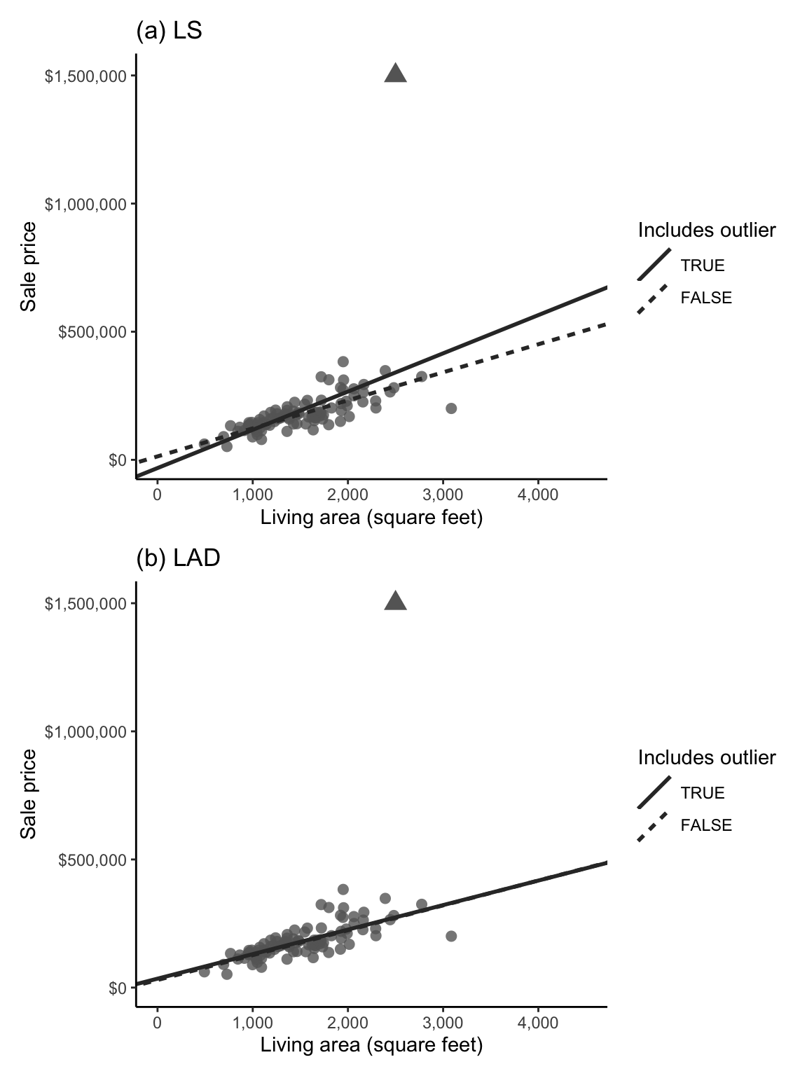
Why does this happen? Mathematically, since the LS algorithm involves computing the squared prediction error for each house, given by \((y - (b_0 + b_1 x))^2\), and since squaring a large error makes it a lot larger (whereas squaring a small error only makes it a little bit larger), the LS algorithm prioritizes minimizing large prediction errors more than the LAD algorithm does, meaning that the LS algorithm will be more influenced by data points with large prediction errors (such as the expensive outlier house in the example above).
That said, the more training data points you have, the less sensitive the LS algorithm will be to outliers (we deliberately used a subsample of just 100 training set houses to create Figure fig-lad-ls-outlier to emphasize the effect of the outlier), so if you have a lot of data, it might not matter much which loss function you use.
To determine whether LS or LAD makes more sense for your particular project in terms of their relative robustness to outliers, it can be helpful to consider the relevant domain context. For the house price project, do you think it makes more sense to report the mean or the median house price? Since most people are not looking to buy exceptionally expensive houses, they are more likely to be interested in median house prices than mean house prices. Based on this logic, LAD might make more sense for this particular project (we don’t want our price predictions to be influenced too heavily by any extreme houses in the training data). As usual, if you’re unsure about which approach to use, try both approaches and compare your results (and maybe even combine them, as we will discuss in sec-combine-ml).
While these robustness considerations can be helpful when deciding which predictive algorithms to use, the most important consideration often ends up being: Which algorithm generates more accurate predictions for future or withheld data? Let’s thus introduce some techniques for assessing the predictive performance of continuous response predictive algorithms.
9.4 Quantitative Measures of Predictive Performance
The code for computing the measures of predictive performance introduced in this section can be found in the 04_prediction_ls_single.qmd (or .ipynb) file in the ames_houses/dslc_documentation/ subfolder of the supplementary GitHub repository.
Having trained a predictive algorithm (e.g., having computed reasonable values for the coefficients of a fitted line of the form \(y = b_0 + b_1 x\)), your next task is to provide a sense of how accurate its predictions are, particularly in the context of the future data to which you intend to apply the algorithm. In this section, we will introduce some measures for evaluating the predictive performance of any continuous response predictive algorithm (i.e., the following measures of predictive performance will not be specific to the LAD and LS algorithms).
Note that when predictive performance is evaluated using the training dataset (i.e., the same data points that were used to compute the predictive fit in the first place), it does not provide a reasonable assessment of how the algorithm would perform on the unseen future data to which the algorithm will eventually be applied. Unfortunately, in the absence of actual future data, it is impossible to provide an exact assessment of how the algorithm will perform in practice. An approximate PCS predictability assessment, however, can be obtained by evaluating the algorithm’s predictive performance using data that resembles the intended future data (e.g., using the validation set).
To conduct such a predictability assessment, we first need to define some predictive performance measures. Computing the prediction error for a particular set of predictions involves evaluating the loss function of your choice by plugging in the relevant predicted response values. While it is common to use the same loss function for both training and evaluating the predictive algorithm, you may use a different loss function if you prefer.
9.4.1 Mean Squared Error, Mean Absolute Error, and Median Absolute Deviation
Recall that our LAD and LS predictive algorithms involve finding the coefficients of a linear fit that minimize the absolute value and squared loss functions, respectively. These very same loss functions can also be used to evaluate the predictive algorithm by plugging in the observed and predicted responses of whichever data points you are using to evaluate the prediction performance.
A very common measure of prediction error that involves plugging the relevant observed and predicted responses into the squared loss function (\(L2\)) is called the mean squared error (MSE). The MSE is given by
\[ \textrm{MSE} = \frac1n\sum_{i=1}^n (\textrm{observed response}_i - \textrm{predicted response}_i)^2. \tag{9.18}\]
Note that although this formula is exactly the same as the formula for the squared loss that the LS algorithm aims to minimize (Equation eq-squared-loss), it can be used to evaluate predictions computed using any algorithm.
The MSE is the average of the squared errors based where, this time, \(n\) is the number of observations in the set being used to evaluate the algorithm. Note that since the MSE is naturally on the scale of the squared response, it is common to instead report the root-mean squared error (rMSE) (i.e., the square root of the MSE), whose value is on the same scale as the original response values in the data.
A similar measure of prediction error that is based instead on the absolute value loss function (\(L1\)) is the mean absolute error (MAE). The MAE is given by
\[ \textrm{MAE} = \frac1n\sum_{i=1}^n \vert \textrm{observed response}_i - \textrm{predicted response}_i \vert. \tag{9.19}\]
Alternatively, the median absolute deviation (MAD) instead computes the median of the absolute errors (rather than the mean):
\[ \textrm{MAD} = \textrm{median}(\vert \textrm{observed response}_i - \textrm{predicted response}_i \vert). \tag{9.20}\]
If we determined that the LAD algorithm makes more sense than the LS algorithm for a particular problem, it is often more intuitive to also evaluate the resulting predictions using the MAE (or MAD), rather than the MSE or rMSE, and vice versa. However, you are more likely to see the MSE or rMSE (rather than the MAE or MAD) in practice because the MSE/rMSE is often the default performance measure.
Moreover, since each performance measure is measuring a different thing (i.e., how far the predicted responses are from the observed responses in absolute or squared loss, on average or in median), these measures are not directly comparable to one another. Each measure should therefore be used independently to compare different predictive fits from the viewpoint of a different loss function. Rather than choosing just one predictive performance measure, we generally recommend computing multiple performance measures to obtain a well-rounded view of the relative predictive performance.
Table tbl-mse-mae-train-table shows the rMSE, MAE, and MAD computed for the training dataset houses for the LS and LAD algorithms, each of which has been trained on the entire training dataset. Note that because we are both training and evaluating the predictions using the training set here, these performance measures do not necessarily reflect how well the algorithms would perform on any future/external data that we would be applying them to in practice. That said, measuring how well these algorithms perform on the training dataset can still help provide a general baseline of the performance potential of your algorithm—if the algorithm can’t even generate accurate predictions for the same set of data points based on which it was trained, then it probably doesn’t have much hope for new data points! In general, you will find that your algorithm performs better when evaluated on the training data versus external or validation data. We will compute these performance measures for the validation set house predictions when we conduct our predictability assessment in sec-ls-predictability.
| Algorithm | rMSE | MAE | MAD |
|---|---|---|---|
| LS | 44,492 | 31,077 | 22,420 |
| LAD | 44,952 | 30,658 | 21,533 |
What do you conclude from the training dataset evaluations presented in Table tbl-mse-mae-train-table? For both algorithms trained and evaluated on the training dataset, the rMSE is just under $45,000, the MAE is just over $30,000, and the MAD is just over $20,000. Recall that a lower rMSE/MAE/MAD implies more accurate predictive performance. When using the rMSE to judge predictive performance, it appears that the LS algorithm performs slightly better, but when using the MAE or MAD to judge predictive performance, the LAD algorithm appears to perform slightly better (although since these are very large numbers, the differences in performance are actually very minor). Are these results surprising? Since the LS algorithm is designed to minimize the squared loss and the LAD algorithm is designed to minimize the absolute value loss, this is actually the expected result (particularly when the evaluation is conducted on the training data—this may not be the case for the validation data).
While rMSE, MAE, and MAD are useful for comparing one algorithm to another based on the same set of data points, they need to be interpreted relative to the scale of the response variable (and thus do not provide a stand-alone picture of an algorithm’s predictive performance). Does an MAE of 31,077 imply good predictive performance? Since the average sale price of houses in the training dataset is $173,407, an average prediction error of around $31,077 (i.e., the average prediction is off by more than $30,000) actually seems quite large. In the next section, we will introduce an alternative performance measure that, unlike the rMSE, MAE, and MAD, is independent of the scale of the response variable.
9.4.2 Correlation and R-Squared
Recall from sec-numeric-explorations of sec-eda that the correlation of one variable with another measures the strength of their linear relationship. It turns out that we can also use the correlation between the observed and predicted response to provide a sense of how related the two variables are. If higher values of the observed response tend to correspond to higher values of the predicted response, then the predictions are probably fairly similar to the observed responses, indicating good predictive performance.
In the context of evaluating a predictive algorithm’s performance, a correlation between the observed and predicted responses that is close to 0 implies that there is no clear linear relationship between the observed and predicted response (very poor performance), whereas a correlation between the observed and predicted responses that is close to 1 implies that the predicted and observed responses have a very strong linear relationship with one another. This means that a higher correlation implies better predictive performance (unlike the rMSE, MAE, and MAD, for which a lower value indicated better predictive performance).
The correlation performance measure can be computed by
\[ \textrm{Corr}(\textrm{obs}, \textrm{pred}) = \frac{\sum_{i=1}^n(\textrm{obs}_i - \overline{\textrm{obs}})(\textrm{pred}_i - \overline{\textrm{pred}})}{\sqrt{\sum_{i=1}^n(\textrm{obs}_i - \overline{\textrm{obs}})^2 \sum_{i=1}^n(\textrm{pred}_i - \overline{\textrm{pred}})^2}}, \tag{9.21}\]
where \(\textrm{obs}_i\) is the observed response for observation \(i\), \(\textrm{pred}_i\) is the predicted response for observation \(i\), \(\overline{\textrm{obs}}\) is the mean observed response, and \(\overline{\textrm{pred}}\) is the mean predicted response. (Note that this is the same as the original correlation formula from Equation eq-correlation in sec-eda.)
Since a correlation measures whether there is a strong linear relationship (e.g., whether larger predicted responses tend to co-occur with larger observed responses) but it doesn’t measure whether the actual values are similar, it is a good idea to look both at the correlation and the rMSE, MAE, or MAD (since these give a better sense of the scale of the prediction errors overall than the correlation).
Table tbl-cor-results shows that the correlation between the observed and predicted sale price for the training dataset houses for both the LS and LAD algorithms is equal to 0.775, which is indicative of decent predictive performance. As a general rule of thumb, a correlation of around 0.6 is OK, a correlation of 0.7 is good, a correlation of around 0.8 is very good, and a correlation of around 0.9 is excellent, but these benchmarks will depend on the context of the problem.
| Algorithm | Correlation |
|---|---|
| LS | 0.775 |
| LAD | 0.775 |
Again, recall that since these results are based on the training data itself, these evaluations are not designed to provide a sense of how well our algorithms will perform on future or external data (we will evaluate the predictive performance on the validation dataset using correlation in our predictability assessment in sec-ls-predictability).
9.4.2.1 R-Squared (Training Dataset Only)
Another common measure of predictive performance is the squared correlation between the observed and predicted response values in the training dataset, often referred to as the \(R^2\), or R-squared, value. The \(R^2\) is computed by
\[ R^2= \textrm{Corr}(\textrm{obs}, \textrm{pred})^2 = \frac{\left(\sum_{i=1}^n(\textrm{obs}_i - \overline{\textrm{obs}})(\textrm{pred}_i - \overline{\textrm{pred}})\right)^2}{\sum_{i=1}^n(\textrm{obs}_i - \overline{\textrm{obs}})^2 \sum_{i=1}^n(\textrm{pred}_i - \overline{\textrm{pred}})^2}, \tag{9.22}\]
and it corresponds to the proportion of the variability in the response that is explained by the features. As with correlation, a larger \(R^2\) value is better. Table tbl-rsq-results shows the \(R^2\) value for the LS and LAD training dataset predictions (confirm that these values are indeed the square of the correlation performance measure reported in Table tbl-cor-results).
Both the LS and LAD algorithms yield training dataset \(R^2\) values of 0.601, indicating that both fitted lines are capturing 60.1 percent of the variability in the original sale price response variable.
| Algorithm | R-squared |
|---|---|
| LS | 0.601 |
| LAD | 0.601 |
As a word of caution, while it is certainly possible to do so, it is not common to compute the \(R^2\) value for validation/test data (or external/future data). Unlike the other performance measures, the \(R^2\) measure is explicitly defined in the context of the training data (and is designed to capture the proportion of the variability in the response that is explained by the features). For this reason, when evaluating predictions for the validation/test dataset (or external/future data), we will stick with the correlation performance measure rather than \(R^2\).
9.4.2.2 Scatterplot of Observed versus Predicted Responses
Recall from sec-scatter in sec-eda, that you can often get a sense of the correlation between two variables by looking at a scatterplot of one versus the other. Figure fig-cor-scatter plots the predicted sale price against the observed sale price for (a) the LS algorithm and (b) the LAD algorithm both trained and evaluated on the training dataset houses. The diagonal line corresponds to predicted prices that are equal to the observed price (i.e., a perfect prediction). The more tightly the points are concentrated on this diagonal line, the better the algorithm is at predicting the response (and the more correlated the predicted and observed responses will be).
As a tip, when you produce a scatterplot of two variables that you expect to have the same range of values, it is a good idea to force the \(x\)- and \(y\)-axes to be identical in range to avoid providing a misleading sense of how similar the actual values in each variable are.
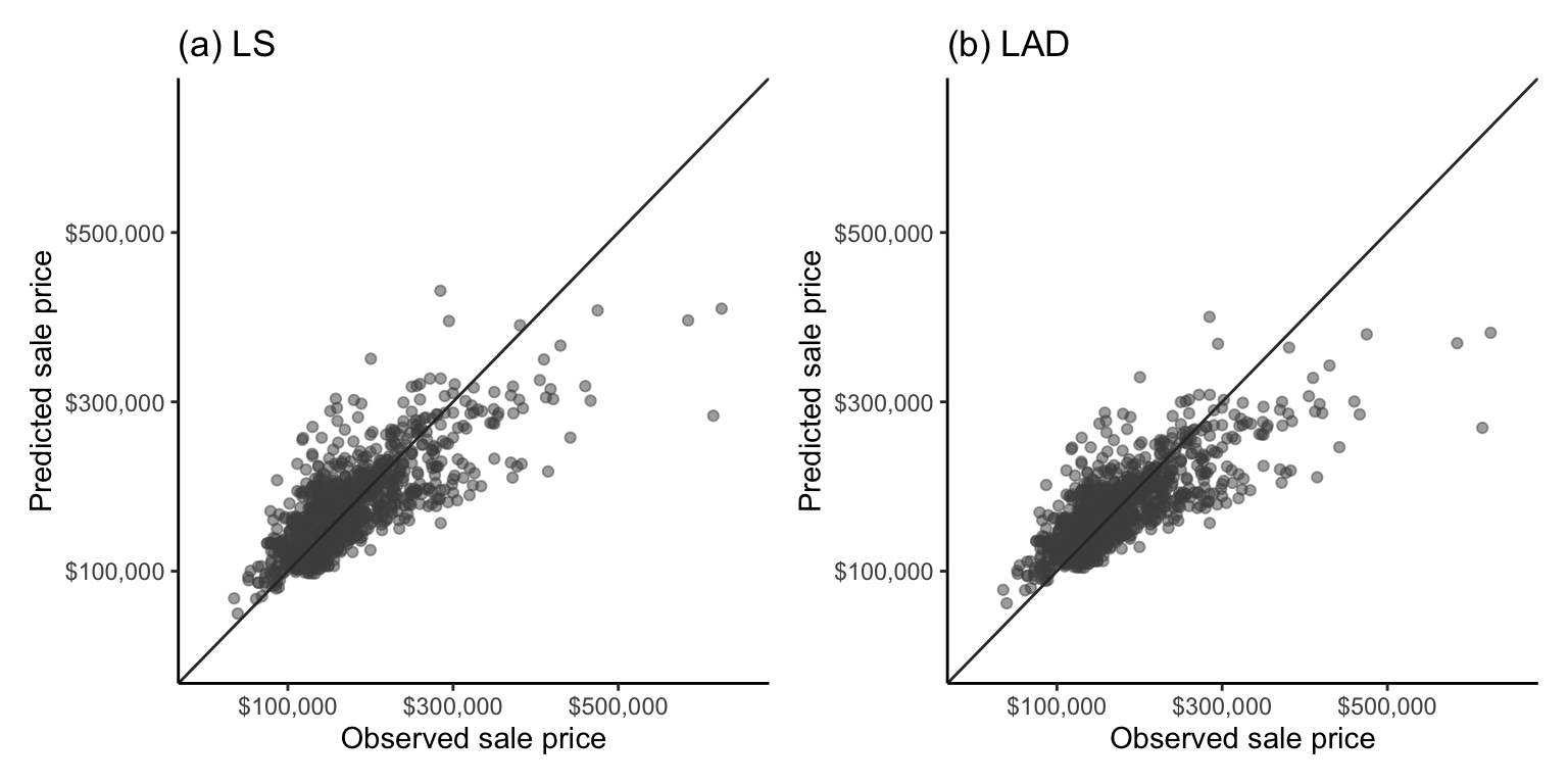
Overall, the predictions for both algorithms look as though they are hugging the perfect prediction diagonal line about as snugly as you might expect from a correlation of 0.775, and unsurprisingly (given our predictive performance evaluations so far), the LS and LAD scatterplots look very similar. Overall, for this problem, we have seen only minor differences between the predictive performance of the LS and LAD algorithms (based on the rMSE, MAE, and MAD measures), and no difference based on the correlation and \(R^2\) measures. However, so far, we have only provided evaluations using the training data and one particular combination of cleaning and preprocessing judgment calls.
The code for computing these measures of predictive performance for the training data can be found in the 04_prediction_ls_single.qmd (or .ipynb) file in the ames_houses/dslc_documentation/ subfolder of the supplementary GitHub repository.
9.5 PCS Scrutinization of Prediction Results
To get a sense of how our LS and LAD predictive fits would actually perform on future data (i.e., the predictability of our results) and the magnitude of the uncertainty associated with the predictions (i.e., the stability of our results), we need to conduct a PCS analysis.
9.5.1 Predictability
So far, we have only evaluated our algorithms using the training set houses. Recall that evaluations based on the training data do not tell us how well the algorithms would perform on future or external data (which is what we actually care about in practice).
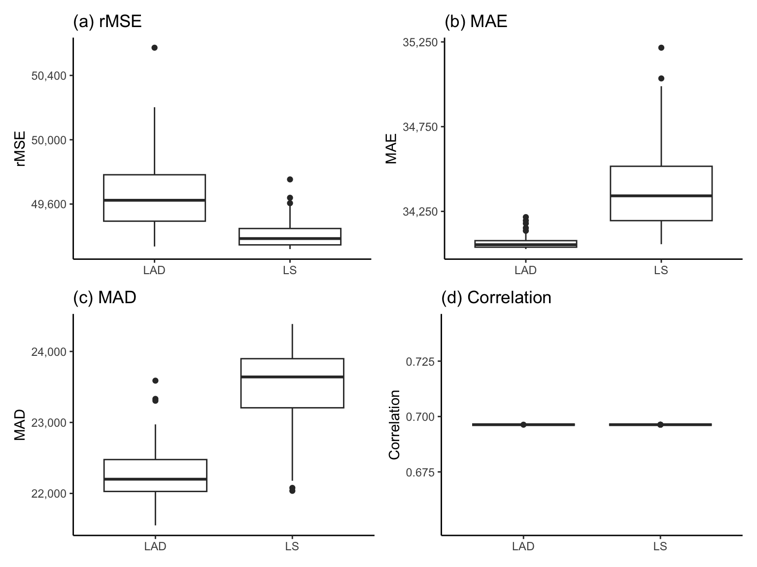
Table tbl-mse-mae-validation-table shows the validation dataset performance of the LS and LAD algorithms using each of the performance measures (rMSE, MAE, MAD, and correlation) introduced previously. The predictive performance is slightly worse when evaluated using the validation dataset compared with the training dataset (which is expected). However, again, we see that the LS algorithm is performing slightly better than LAD in terms of the rMSE, but worse in terms of the MAE and MAD (but the differences are fairly mild). Again, there is no difference in performance between the LS and LAD algorithms in terms of the correlation.
| Algorithm | rMSE | MAE | MAD | Correlation |
|---|---|---|---|---|
| LS | 49,377 | 34,714 | 24,150 | 0.696 |
| LAD | 49,507 | 34,303 | 22,188 | 0.696 |
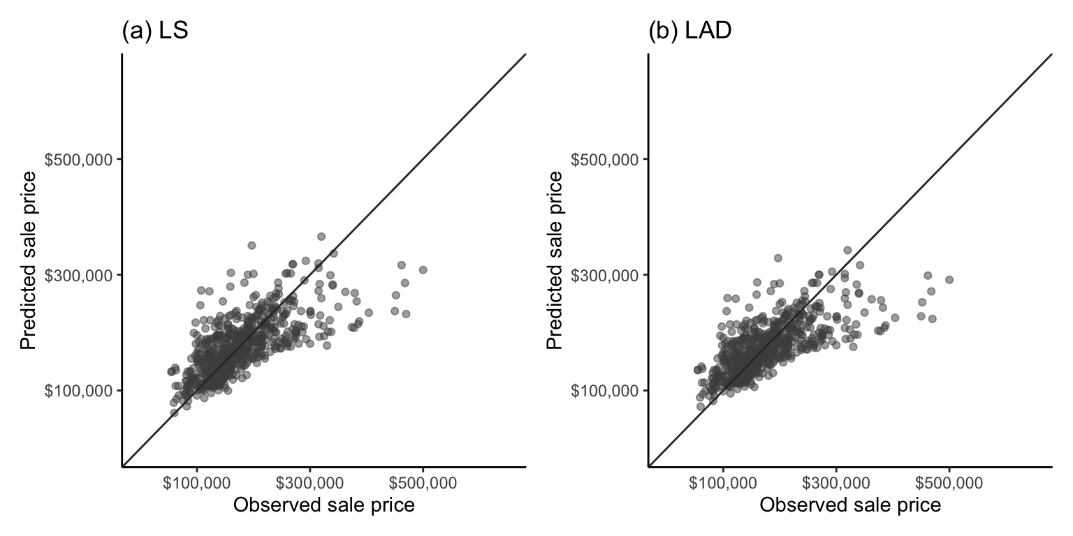
Figure fig-cor-scatter-val shows a scatterplot of the observed validation set sale prices against the predicted sale prices for the (a) LS and (b) LAD algorithms. Overall, the tightness of points in the scatterplot seems similar to those from the training set in Figure fig-cor-scatter, and there is very little observable difference between the two algorithms.
Recall that since the time period captured by the validation set (which contains houses sold between August 2008 and July 2010) takes place after the time period captured by the training set (which contains houses sold between January 2006 and August 2008), this validation set assessment provides a reasonable proxy evaluation of how our algorithm may perform in the future period of interest in the year 2011 (assuming that the underlying house market trends do not change dramatically between 2010 and 2011). However, if we wanted to apply the algorithm in a different scenario (e.g., to houses in a different city in Iowa), we would need to conduct a predictability assessment of our algorithms using validation data that reflects this scenario.
The code for conducting these predictability assessments can be found in the 04_prediction_ls_single.qmd (or .ipynb) file in the ames_houses/dslc_documentation/ subfolder of the supplementary GitHub repository.
9.5.2 Stability
For each algorithm introduced in this book, we primarily investigate three sources of uncertainty: the uncertainty arising from the data collection process, our cleaning and preprocessing judgment calls2, and our choice of algorithm. However, in this section, we will focus primarily on evaluating the stability of our predictions to reasonable data perturbations (i.e., assessing the uncertainty arising from the data collection process) and our choice of algorithm (by comparing LS and LAD).
Note that if you are a Python user, the Yu research group has created the veridical-flow Python library for conducting stability analysis across different data perturbations, as well as cleaning, preprocessing, and algorithmic judgment calls in the context of predictive algorithms. This veridical flow library is not yet available in R, but the code for conducting the following stability assessment “manually” in R (and in Python) can be found in the 04_prediction_ls_single.qmd (or .ipynb) file in the ames_houses/dslc_documentation/ subfolder of the supplementary GitHub repository.
9.5.2.1 Stability to Data Perturbations and Choice of Algorithm
To assess the stability of our predictions to appropriate perturbations in the data, we first need to decide what constitutes an appropriate perturbation. That is, what type of data perturbation (e.g., adding random noise and/or bootstrapping) most resembles the way that the data could have been measured or collected differently?
While the Ames housing data does not correspond to a random sample from a greater population of houses, each house is more or less exchangeable (any individual house being included in the data had no bearing on any other house being included), which means that a random sampling technique, such as the bootstrap, could be a reasonable data perturbation. Moreover, it is plausible that the living area measurements might be subject to a slight amount of measurement error (e.g., if the area of each house was approximated and/or could have been measured by a different person). Based on our own opinion and intuition, we therefore also decided to conduct a perturbation that involves adding or subtracting a random number between 0 and 250 square feet to 30 percent of the living area measurements (250 is around half of the SD of the living area variable in the training data, and the proportion of houses to add noise to, 30 percent, was chosen fairly arbitrarily). We thus created 100 area-perturbed bootstrapped versions of the training datasets and we retrained the LS and LAD algorithms on each of the perturbed datasets.
The boxplots in Figure fig-pred-perf-perturb-plot-ls-lad show the distribution of the validation dataset3 rMSE, MAE, MAD, and correlation performance measures for the LS and LAD algorithms each trained separately on the 100 perturbed versions of the training data (where each perturbed dataset corresponds to a bootstrapped sample of the training dataset in which 30 percent of the living area measurements had a small amount of random noise added to them).
Note that the \(y\)-axis ranges of the rMSE, MAE, and MAD boxplots in Figure fig-pred-perf-perturb-plot-ls-lad are actually very narrow (each spanning a range of less than $3,000). Therefore, despite the apparent differences between the LS and LAD algorithms, as well as the spread of the values in each boxplot, the predictive performance is actually very stable across both the choice of algorithm and the data perturbations. The correlation measure in Figure fig-pred-perf-perturb-plot-ls-lad(d) does not suffer from this issue since it is essentially identical across all the perturbations, indicating very high stability to both the choice of algorithm and the data perturbations.
9.5.2.2 Prediction Stability Plots
Let’s examine the stability of the individual response predictions to our perturbations. In Figure fig-pred-interval-plot, we produce a plot that corresponds to a stability-enhanced counterpart to the correlation scatterplot from Figure fig-cor-scatter-val. Figure fig-pred-interval-plot shows the range (as a line segment) of the perturbed predicted responses (\(x\)-axis) against the actual observed response (\(y\)-axis) for the validation set. The shorter the perturbed prediction line segment for a data point, the more stable its perturbed predictions are. We call this plot a prediction stability plot.
Note, however, that comparisons of the stability of predictions from across algorithms must be considered relative to a common set of perturbations. This is because the more perturbations we conduct, the wider the range of perturbed predictions we will obtain.
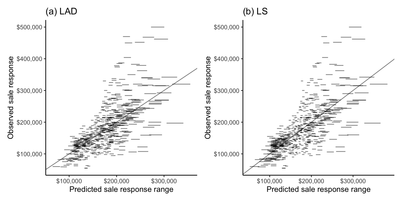
Overall, the predictions for both algorithms are impressively stable (the line segments are fairly narrow), especially for houses in the middle of the price range. Notice that the line segments get slightly wider (i.e., the predictions become less stable) for houses with more extreme (particularly high or low) predicted sale prices.
Notice that very few of the predicted sale price line segment intervals in Figure fig-pred-interval-plot actually contain (“cover”) the observed sale price response (they rarely intersect the diagonal line). This means that while the predictions are very stable, the prediction ranges that the perturbations produce have very low coverage. We will discuss creating prediction intervals in sec-combine-ml.
Recall that the code for conducting these stability assessments can be found in the 04_prediction_ls_single.qmd (or .ipynb) file in the ames_houses/dslc_documentation/ file of the supplementary GitHub repository.
Exercises
True or False Exercises
For each question, specify whether the answer is true or false (briefly justify your answers).
For any given set of training data points, there is an explicit mathematical formula that we can use to compute the parameters of the LAD line (i.e., the line that will minimize the absolute value loss function).
For any given set of training data points, there is an explicit mathematical formula that we can use to compute the parameters of the LS line (i.e., the line that will minimize the squared loss function).
The loss function that you used to train your predictive algorithm must match the loss function that you use to evaluate the predictions.
The LAD algorithm will always produce more accurate predictions on the validation set than the LS algorithm when using the MAE predictive performance measure.
The rMSE is on the same scale as the MAE.
If you have trained two predictive algorithms, it is possible for one to perform better according to the validation dataset MSE and the other to perform better according to the validation dataset MAE.
It is acceptable to use a predictive algorithm to predict the response of future data points that are quite different from the training data if you have shown that the algorithm generates accurate predictions for data points similar to the future data points.
The prediction error computed on the training data does not provide an appropriate assessment of how the algorithm will perform on future data.
One example of a PCS predictability assessment of a predictive algorithm is to compute the MAE for the predictions computed for the training data.
Conceptual Exercises
Explain what we mean when we say that “the LAD algorithm is more robust to outliers than the LS algorithm”, and explain why this is the case.
Provide two reasons why the LS algorithm is more common in practice than the LAD algorithm.
One possible fitted line for predicting sale price using area is given by \(\textrm{predicted price} = 12,000 + 121 \times \textrm{area}\).
What does the intercept term being equal to \(12,000\) tell you about the predictions generated by this fitted line?
What does the area coefficient term being equal to \(121\) tell you about the predictions generated by this fitted line?
Suppose that you have also computed another line that is given by \(\textrm{predicted price} = 10,000 + 122 \times \textrm{area}\). Describe how you would use the validation dataset to compare the predictive performance of these two fitted lines.
Compute the predicted price of a \(2,000\)-square-foot house using each fitted line.
Explain why the training dataset MSE will always be lower for an LS fitted line than for an LAD fitted line (when both lines are computed using the same training dataset). Is this also the case when MSE is computed based on the validation dataset predictions?
Provide one pro and one con of using the correlation performance measure (vs the rMSE performance measure).
Mathematical Exercises
For a fitted line of the form: \(\textrm{predicted price} = b_0 + b_1 \textrm{area}\).
Show that the predicted price of a \(0\)-square-foot house is equal to \(b_0\).
Show that the predicted price of a house will increase by \(b_1\) if we increase the living area of the house by a value of 1.
The LS algorithm for generating fits of the form \(y = b_0 + b_1 x\) aims to find the values of \(b_0\) and \(b_1\) that minimize the squared loss function, which is given by \(\frac{1}{n}\sum_{i = 1}^n(y_i - (b_0 + b_1 x_i))^2\).
By differentiating the squared loss function in terms of \(b_0\) and setting the derivative to zero, show that the value of \(b_0\) that minimizes the squared loss is given by \(b_0 = \bar{y} - b_1 \bar{x}\).
By differentiating the squared loss function in terms of \(b_1\) and setting the derivative to zero (you can substitute in the value of \(b_0\) that you computed previously), show that the value of \(b_1\) that minimizes the squared loss is given by \(b_1 = \frac{\sum_{i = 1}^n (x_i - \bar{x})(y_i - \bar{y})}{\sum_{i = 1}^n (x_i - \bar{x})^2}\).
Adapt your computations for exercise 16 to find the LS coefficients \(b_0\) and \(b_1\) for the following simpler fits:
\(y = b_0\).
\(y = b_1x\).
Suppose that you are trying to develop an LS linear fit for predicting student scores on a final end-of-semester exam based on their score on a midterm exam (both are out of 100). To compute your LS fit, you plan to use the scores from the 15 students who took the class last year. The following table shows the previous year’s student’s scores in the midterm and final exams:
Student Midterm Final 1 24 50 2 48 52 3 48 52 4 52 52 5 47 59 6 46 69 7 56 76 8 81 78 9 62 82 10 80 88 11 65 88 12 82 90 13 71 94 14 95 96 15 98 98 Write the format of the line you are trying to compute in terms of the “midterm” and “final” variables and the \(b_0\) and \(b_1\) parameters (you don’t need to compute the values of \(b_0\) and \(b_1\) yet).
Compute the LS fitted line coefficients \(b_0\) and \(b_1\) by hand (using the formulas provided in this chapter) and write the equation of your fitted line (i.e., plug in the values of \(b_0\) and \(b_1\) for the line you identified for the previous task).
Provide some intuition for what the values of \(b_0\) and \(b_1\) that you computed tell you about the predictions generated by your linear fit.
Predict the final exam score for a student who scored 75 out of 100 on the midterm.
Predict the final exam score for a student who scored 99 out of 100 on the midterm. If your prediction exceeds 100 (which wouldn’t technically be possible on an actual exam, which is out of 100), suggest how you would interpret this prediction.
Show that the two formulations (in Equation eq-b1-xy and Equation eq-b1-xy-cor) for the \(b_1\) LS coefficient are equivalent. That is, show that \[Corr(x, y) \frac{SD(y)}{SD(x)} = \frac{\sum_{i = 1}^n (x_i - \bar{x})(y_i - \bar{y})}{\sum_{i = 1}^n (x_i - \bar{x})^2}.\]
The equations for correlation and standard deviation can be found in Equation eq-correlation and Equation eq-sd in sec-eda.
Coding Exercises
This question refers to the midterm and final exam scores shown in Exercise 18. The data can be found in the
exercises/exam_scores/data/scores.csvfile on the supplementary GitHub repository (or you can copy the data from the table above). We recommend using R or Python to complete the following tasks.Create a scatterplot of the midterm scores (\(x\)-axis) against the final exam scores (\(y\)-axis) for the 15 students.
Compute the correlation between the midterm and final exam scores. Based on the scatterplot and correlation computation, do you think that the midterm exam score is likely to be a good predictor of the final exam score?
Use the LAD algorithm (e.g., using the
lad()function from the L1pack R package, with the argumentmethod = "EM") to generate a linear fit for the final exam scores based on the midterm exam scores. In Python, you can use thelinear_model.LADRegression()class from the sklego library.Use the LS algorithm (e.g., using the formulas, using the
lm()R function, or using thelinear_model.LinearRegression()class from the scikit-learn library in Python) to generate another linear fit for the final exam scores based on the midterm scores.Using each fit, predict the final exam score of a student who got 75 on the midterm exam.
Add your LAD and LS fitted lines to the scatterplot you produced in part (a) (if you’re using ggplot you may find the function
geom_abline()useful).The file
scores_val.csvcontains the midterm and final exam scores for 12 students who took the class during the summer session. Compute a predictability analysis of each of your fits trained on the 15 original scores by evaluating the predictive performance for these summer session students. Compute the rMSE, MAE, MAD, and correlation values in your evaluation, and visualize the relationship between the observed and predicted responses using a scatterplot.Conduct a stability analysis in which you examine the uncertainty associated with the data collection (i.e., by conducting reasonable data perturbations). Justify the perturbations that you choose, and create a prediction stability plot for each algorithm (the ggplot function
geom_segment()will be helpful for creating the line segments in R). Comment on your findings.
Repeat the Ames house price prediction analyses (including the PCS analysis) that we conducted in this chapter using a different predictor variable (i.e., a variable other than
gr_liv_area). De Cock’s data has dozens of predictive variables to choose from (we recommend picking another variable that seems to be fairly predictive of sale price). You may find the code in the04_prediction_ls_single.qmd(or.ipynb) file in theames_houses/dslc_documentation/subfolder of the supplementary GitHub repository helpful.
Project Exercises
Predicting happiness In this project, your goal will be to predict the happiness of a country’s population4. The data that you will be using for this project comes from the World Happiness Report and can be found in the
exercises/happiness/data/folder in the supplementary GitHub repository.Read through the background information provided on the World Happiness Report website, as well as the pdf provided in the
exercises/happiness/data/data_documentation/subfolder in the supplementary GitHub repository. In the01_cleaning.qmd(or.ipynb) file in theexercises/happiness/dslc_documentation/subfolder, summarize anything interesting you learn about how the data was collected, what it contains, and document any questions you have (about either the background domain or the data itself).In the
01_cleaning.qmd(or.ipynb) code/documentation file in the relevantexercises/happiness/dslc_documentation/subfolder, conduct data cleaning and preprocessing explorations. While we recommend writing your own cleaning/preparation function, if you are short on time, we have provided a sample function for producing one clean version of the data in thecleanHappiness.R(or.py) file in theexercises/happiness/dslc_documentation/functions/subfolder. You may wish to filter the data to a single predictor variable that you plan to use to predict the happiness response.Given that the goal of the project is to predict future happiness scores, discuss how you would split the data into training, validation, and test datasets (we will use the test dataset in sec-combine-ml). In a new
prepareHappiness.R(or.py) file in theexercises/happiness/dslc_documentation/functions/subfolder, write some code to prepare the relevant cleaned training and validation datasets (your code should use the data cleaning function from task (b)). You can source this file to load the cleaned training and validation datasets in each subsequent analysis document.In the
02_eda.qmd(or.ipynb) code/documentation file in the relevantexercises/happiness/dslc_documentation/subfolder, conduct an exploratory data analysis (EDA) of the training data (feel free to just focus on the happiness variable and the single predictor variable of your choosing, both separately and in terms of their relationship with one another).In the
03_prediction.qmd(or.ipynb) code/documentation file in the relevantexercises/happiness/dslc_documentation/subfolder, train the LAD and LS linear fits for predicting happiness (using your training data) based on a predictor variable of your choosing. Report the formulas for your fitted models.Conduct a PCS evaluation by evaluating the predictability (using your validation dataset) and stability (based on reasonable data perturbations) of your linear fits. Comment on your results.
Train some additional linear fits for predicting happiness using different predictor variables. Compare these additional fits to your original fit based on their predictive performance on the validation dataset.
References
Barrodale, I., and F. D. K. Roberts. 1973. “An Improved Algorithm for Discrete L1 Linear Approximation.” SIAM Journal on Numerical Analysis 10 (5): 839–48.
Osorio, F., and T. Wolodzko. 2022. “L1pack: Routines for L1 Estimation.”
Teets, Donald, and Karen Whitehead. 1999. “The Discovery of Ceres: How Gauss Became Famous.” Mathematics Magazine 72 (2): 83–93.
We are focusing on 2011 because we are unlikely to be able to generate accurate predictions for today’s housing market using the Ames housing data that was collected over a decade ago.↩︎
Since the predictive algorithms in this chapter involved only the sale price response and the living area predictor variables (and most of our preprocessing judgment calls did not affect these two variables), it is not necessary to assess the uncertainty associated with our data cleaning and preprocessing judgment calls here.↩︎
Note that we could have used the training dataset to conduct our stability performance evaluations, but we prefer to conduct evaluations using the validation dataset wherever possible.↩︎
Happiness is measured based on the national average response to the question “Please imagine a ladder, with steps numbered from 0 at the bottom to 10 at the top. The top of the ladder represents the best possible life for you and the bottom of the ladder represents the worst possible life for you. On which step of the ladder would you say you personally feel you stand at this time?”↩︎